
The following article is from my Business Intelligence Project which involves a fictional real estate company based in New York.
Business Problem Formulation
Company Background
Rise Real Estate, established in 2002, is a company that specializes in analyzing, designing, and competing in the real estate sector in the United States (US). It has contributed to the growth of the US economy through investments and specializes in residential and mixed-use properties. They also invest in properties across borders and have a good reputation in industrial property management. They pride themselves in providing professional, trustworthy, and integrity service to clients.
Problem Statement
The business entity concerned with this case is the aforementioned RRE who now wishes to focus on real estate trading in New York City (NYC). Real estate trading in this sense involves buying real estate with the sole intention of holding it for a brief period of time before selling it off for a profit. Executing this idea is no simple task though, as several problems lie along the way. Key among them are,
(a) Real estate market similar to other financially influenced markets is not a solitary one and never will be one. Countless other factors influence them and gathering all the necessary data, aggregation, analyzing and reporting process simply takes too much time.
(b) Even if all the data required in (a) are present, it does not mean anyone can generate the required reports. Additional delegation tasks need to be handed out to technical teams as traditional tools are inept when dealing with massive amounts of data and the job can be expected to be complete based on their other pending tasks. All this spells out additional time wasting.
(c) The common theme from (a) and (b) is time, or a lack thereof. Excessive time spent on the decision-making process shall result in an unoptimized usage of company’s resources and even worse, clients will choose competitors and profits will promptly decrease. Additional time spent there might also mean that the company is not fast enough in reacting to market’s sensitivity.
(d) As mentioned in (a) required data are from various sources and in the process of extracting them, the higher the chances are for disorder and missing data at any point in time. This process is simply too risky and inefficient.
(e) (a) to (b) leads us to actionable insights that the company can derive quickly and the plain reality is, using traditional tools, it simply is not possible.
Goals and Objectives
A clear distinction between goals and objectives is a goal is an achievable outcome that is typically broad and long-term, while an objective defines measurable actions to achieve the stated overall goal. For the purposes of this project, the goal is an outcome-oriented goals which means the entire focus shall be on the end result and specific deadlines may be pushed back to achieve the desired outcome and quality. Objectives on the other hand will be strategic objectives in that they help to create the overall vision of the project. The goal and objectives for this project are,
Goal: Develop and deploy a dashboard that provides an overview, visualization, data tables, drill-down capabilities and data filters of all the relevant information on recent property sales in NYC together with the factors that correlate with the property value. This will act as a business intelligence (BI) solution that can assist in deriving quick actionable insights.
Objectives:
- Primary data collection of all available data on property sales in NYC.
- Secondary data collection of Consumer Price Index (CPI), federal interest rates, population estimates and unemployment rates in NYC.
- Perform correlation study of primary data against secondary data.
- Development of the dashboard which includes the integration of the primary data and secondary data.
- Deployment of the developed dashboard.
Relevant Stakeholders
Recognizing the parties who have an interest or a stake in a business is important because it can help achieve the previously established goals and objectives. In the context of business projects, stakeholders can be classified as internal and external. Internal stakeholders, such as employees, owners, managers, and directors, have a direct impact on the organization’s goals and can take primary responsibility for project management. External stakeholders, such as customers and suppliers, have an indirect impact and are considered to have secondary responsibilities.
For this project, the stakeholders will be internal stakeholders and specifically, members of the upper management who are involved in strategic decision-making. Therefore, executives and directors are the key stakeholders. The decisions taken in this project will have a long-term impact due to the nature of the investment, as they involve a lot of uncertainty and high risk. These decisions include technology, capacity, and facilities decisions. As the organization needs to be more competitive in the real estate sector, it’s important to identify benchmarks. The directors, as the primary stakeholders, are responsible for making decisions based on the analysis provided and managing the schedule and budget of the project.
Data
Primary Data – NYC Property Sales
Complete property sales data in New York City are available as free public datasets on the NYC Department of Finance website. For the purposes of this project, we shall focus on all the property sales in 5 boroughs (Manhattan, Bronx, Brooklyn, Queens, Staten Island) that make up NYC. The snippet of the download section for 2021 is illustrated in Figure 1.
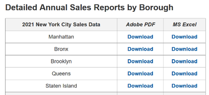 Figure 1: Snippet of Download Section for Property
To make this project as concise and relevant as possible, only data from the past 11-year timeframe shall be collected. This means data from the year 2011 to 2021. The file format that shall be downloaded is in .xlsx to ensure ease of processing with its tabular format. To facilitate the downloading of 11-year x 5 boroughs = 55 files and the merging of those files, a custom python script shall be developed to web scrape and merge the data. Key features from the files will be neighbourhood, zip code, land square feet, and sale price. The snippet of one of the downloaded property sales files is depicted in Figure 2.
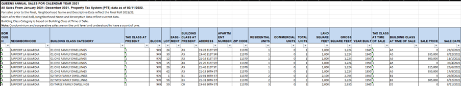 Figure 2: Snippet of Downloaded Property Sales File
Secondary Data – Consumer Price Index
The Consumer Price Index (CPI) is a measure of the average change in prices over time for a basket of goods and services consumed by households. It is used to measure inflation and is calculated by comparing the cost of a fixed basket of goods and services at a specific time period to the cost of the same basket in a base period. The basket of goods and services is chosen to represent the spending patterns of the typical consumer. The CPI is used by governments, businesses, and individuals to make decisions about wages, prices, and other economic activities. It is often used as a measure of the cost of living for a specific area or country. CPI data is available by state as free public datasets on the U. S. Bureau of Labor Statistics website. The data shall be downloaded in .xlsx format and further processing using Python Pandas library shall take place to remove unnecessary columns and organize year and month in the same column. As mentioned earlier, only data from 2011 onwards shall be considered. The snippet of the downloaded CPI file is illustrated in Figure 3.
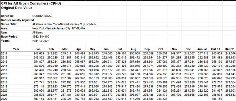 Figure 3: Snippet of NYC CPI Data (2011-2022)
Secondary Data – Federal Interest Rates
Federal interest rates refer to the interest rate set by the Federal Reserve, the central bank of the US, on the money it loans to commercial banks. The Federal Reserve sets a target range for the federal funds rate, which is the interest rate at which banks can borrow money overnight from each other through the Federal Reserve’s discount window. The target range is set by the Federal Open Market Committee (FOMC), which meets regularly to make decisions about monetary policy. The Federal Reserve uses changes in the federal funds rate as a tool to influence the economy. When the rate is low, it encourages borrowing and spending, which can boost economic growth. When the rate is high, it can slow down borrowing and spending, which can help curb inflation. Federal funds interest rates are available on a monthly basis from July-1994 till present on the Economic Research of the Federal Reserve Bank of St. Louis website. Data is downloaded in .csv format and some data processing will be done to only keep data from 2011 onwards by year and month. The snippet of the downloaded file is illustrated in Figure 4.
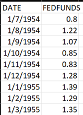 Figure 4: Snippet of Downloaded Interest Rates
Secondary Data – Unemployment Rates
Unemployment rate is a measure of the percentage of the total labor force that is unemployed but actively seeking employment and willing to work. It is a key indicator of the health of the labor market and the overall economy. The rate is calculated by dividing the number of unemployed individuals by the total number of individuals in the labor force (employed and unemployed). The unemployment rate can be affected by various factors such as economic growth, demographic changes, and government policies. A low unemployment rate generally indicates a strong economy, while a high unemployment rate may indicate economic weakness. The unemployment rate is closely watched by policymakers, investors, and individuals, as it can have a significant impact on consumer spending, business investment, and other economic activities. Unemployment rates in NYC are available by state as free public datasets on the U. S. Bureau of Labor Statistics website. The data shall be downloaded in .xlsx format and further processing will be done to remove unnecessary columns and organize year and month in the same column. The snippet of the downloaded file is illustrated in Figure 5.
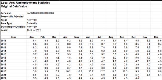 Figure 5: Snippet of Unemployment Rates
Secondary Data – NYC Population Estimates
There is a complex relationship between population and real estate prices. In general, an increase in population can lead to an increase in demand for housing, which can drive up real estate prices. This is because as the population grows, there are more people in need of a place to live, which can lead to competition for available housing and increase the prices. However, other factors such as economic conditions, interest rates, and availability of credit also play a role in determining the housing prices. In addition, population density and the pace of population growth can also affect real estate prices. For example, in areas with high population density, there may be a limited supply of land for new development, which can drive up prices. Similarly, in areas where population is growing rapidly, there may be a shortage of housing as demand outstrips supply, which can also lead to higher prices.
Official population data is not available for every year since the population census is only conducted by random intervals. The workaround for this problem is by making use of population estimates which are readily available as free public datasets on NYC’s official website. Data shall be downloaded in .csv format and further data processing will take place to only filter the 5 boroughs that are concerned with this project, removal of years prior to 2011, and prioritizing census base population over population estimates. Snippet of the population estimates is illustrated in Figure 6.
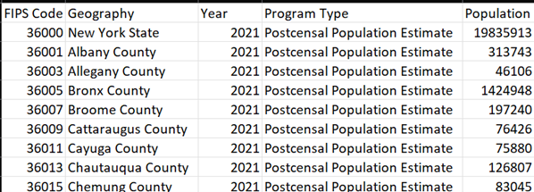 Figure 6: NYC Population Estimates
However, it’s important to note that population growth alone is not the only factor that determines real estate prices. Other factors such as local economic conditions, availability of financing, zoning and land-use regulations, and overall market sentiment also play a role.
Data Cleaning
Data cleaning in the simplest sense here refers to the steps involved in making sure that data is properly formatted, consistent, and free of errors. This may involve identifying and correcting any issues in the data, and ensuring that it is ready for further analysis or use. The steps mentioned are listed below and applies to all the data that is involved in this project.
(a) Duplicate values removal (b) Irrelevant observations/values/columns removal (c) Addressing missing values (d) Data types checking and reformatting (e) Addressing outliers (f) Addressing mislabelled values if present
Steps (a) to (f) are carried out in no particular order and are carried out in two phases, first during data collection steps and second, during data integration in Power BI. This is to save time, processing power and increase reliability in the data. The example code for data cleaning during the data collection step using Python is shown in the code block below,
1
2
3
4
5
6
7
8
9
10
11
12
13
14
15
16
17
18
df_list = []

for file in tqdm(data_files, desc='Loop 1', colour='Green'):
    if file[-6:] != '.ipynb':
        df = pd.read_excel(file)
        for i in range(len(df)):
            if df.iloc[i][0][0:3] == 'BOR':
                df = df[i:]
                df.reset_index(inplace=True, drop=True)
                df.columns = colname
                df = df.drop(0)
                df.reset_index(inplace=True, drop=True)
                df.drop(['EASE-MENT'], axis=1, inplace=True)
                df = df[df['SALE PRICE'] != 0]
                df_list.append(df)
                break
            else:
                continue
Data Integration
Data integration in this project’s context refers to the process of combining data from multiple sources into a single, unified view. This involves extracting data from various sources, transforming it to a consistent format, and loading it into a central repository which is Microsoft Power BI for this project. The goal of data integration is to make it possible to analyze and gain insights from a diverse set of data, often from different systems or formats, in order to support BI, reporting, and other data-driven decision-making. Before the integration process however, a clear understanding is required for all the data at play. This is to ensure any BI insights later on is based on an educated guess.
To achieve this, a correlation study is performed for the primary data and the secondary data. In essence, a correlation study is a statistical analysis that assesses the relationship between two or more variables. The study typically involves collecting data on the variables of interest, and then using statistical techniques to measure the degree of association between them. The result of a correlation study is a correlation coefficient, which ranges from -1 to 1. A coefficient of 1 indicates a perfect positive correlation, meaning that as one variable increases, the other variable also increases. A coefficient of -1 indicates a perfect negative correlation, meaning that as one variable increases, the other variable decreases. A coefficient of 0 indicates no correlation. Conventional rules for interpreting correlation coefficient are illustrated in Figure 7. It must be noted that the interpretations in Figure 7 is applicable for the negative value as well.
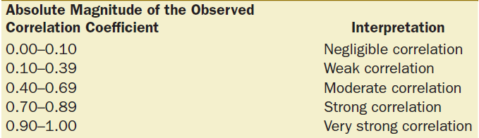 Figure 7: Conventional Interpretation of Correlation Coefficient Schober & Schwarte, 2018
The primary and secondary data are all first merged together to perform the correlation study. The snippet of this merged data is depicted in Figure 8.
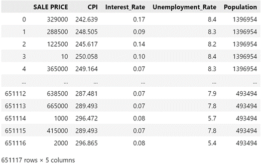 Figure 8: Snippet of Merged Data
Using the merged data in Figure 8, a correlation study using the Pearson Correlation method is performed and the results are illustrated in Figure 9.
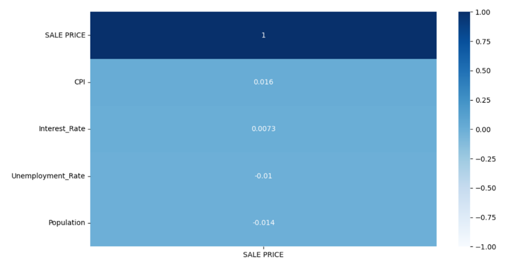 Figure 9: Pearson Correlation Results
Interpreting the results in Figure 9 using the convention from Figure 7 tells us that all the secondary data has negligible correlation with sale prices. A particular drawback with Pearson correlation is that it requires its data to be normally distributed and no extreme outliers present. To check if the merged data are indeed affected by those requirements, a Spearman Rank Correlation is performed as it is outlier resistant and does not need its data to be normally distributed. The results are illustrated in Figure 10.
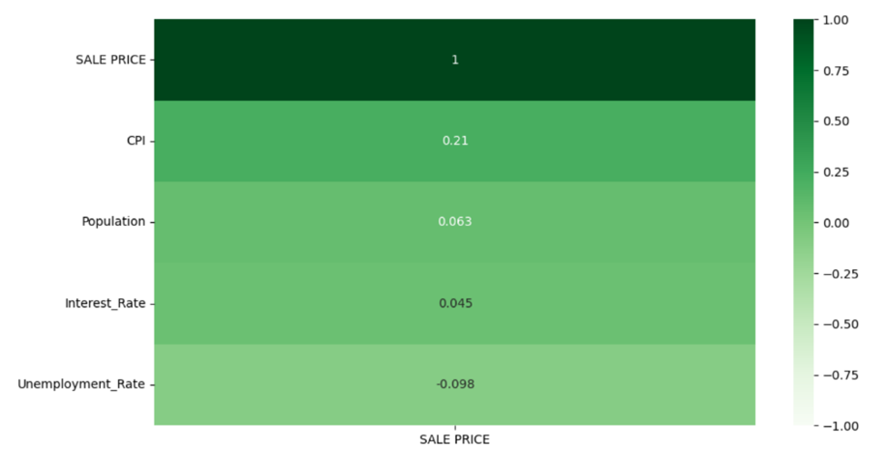 Figure 10: Spearman Rank Correlation Results
Interpreting the results in Figure 10 using the convention from Figure 7 informs us that only CPI rates has a weak correlation with sale prices. Based on Figure 9 and Figure 10, removing all the secondary data with negligible correlation might be a naïve move as correlation does not imply causation, it only implies a relationship between two variables, and additional research is needed to establish causality. Furthermore, all those secondary data might prove to be useful to the stakeholders who would like to have an up-to-date view of the economic indicators in NYC in the dashboard.
Data Story Telling
Big Idea
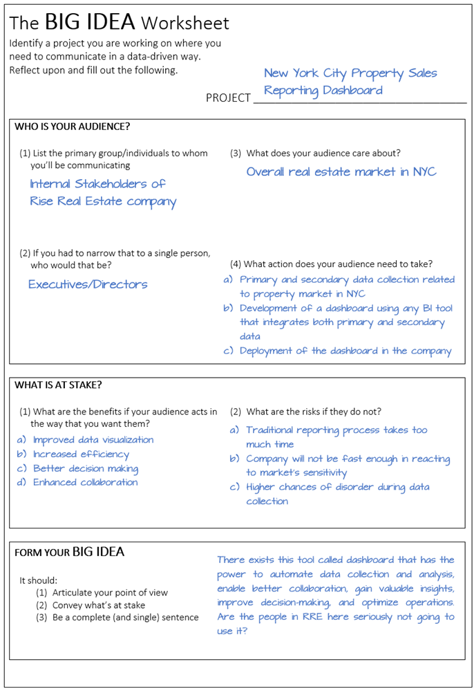 Figure 11: Big Idea Worksheet of Project
Storyboard
Problem
(a) Issue: Scattered data and too much time taken in reporting process
(b) Current Implementation: Traditional reporting tools using spreadsheets and PowerPoints
(c) Impact: Traditional reporting simply takes too much time and the company will not be fast enough in reacting to market’s sensitivity
Action
(a) Action Taken: Collect primary data (NYC property sales from 2011-2022) and secondary data (CPI rates, federal funds interest rates, unemployment rates and NYC population estimates)
(b) Goal: Develop and deploy a dashboard that provides an overview, visualization, data tables, drill-down capabilities and data filters of all the relevant information on recent property sales in NYC together with the factors that correlate with the property value.
(c) Based on collected data: Perform correlation study of all the secondary data against the sale prices.
(d) Recommended solution: Commence the development of the dashboard immediately. The next 2 targets related to this project should be the deployment of the dashboard and the profit comparison (Before and After implementation of the dashboard).
Outcome
(a) Call to action: In the age of technology and Big Data, to not use a powerful tool that could simplify so many things is not what we do here in RRE.
(b) What do you need to do? No technology is ever perfect on its very first iteration. Maximize the potential (valuable insights) of the developed dashboard and be sure to regularly feed it with improvement (up-to-date data, query optimization, data quality improvement, etc…). With technology (dashboard) and continuous improvement, is there anything we will not achieve here in RRE?
Storyline
The year is 2023, and right in the heart of the bustling city of New York, there was a real estate trading company that had been in business for many years. They had a reputation for being one of the best in the industry, but their management team had always felt that something was missing. They had a lot of data, but it was scattered, difficult to access and takes too much time. They couldn’t seem to get a clear picture of their business and make informed decisions as they had hoped.
One day, a mysterious figure appeared at their office, claiming to have the solution to their problems. They introduced the management team to the mystical power of dashboards. The team was sceptical at first, as should anyone when a mysterious figure approaches them, but as the mysterious figure began to demonstrate how dashboards could provide a clear and efficient way to view and analyze their business data, they became convinced. Dashboards could potentially provide real-time data on market trends (multiple data sources) and key performance indicators, enabling them to make better decisions about their business.
The mysterious figure also showed them how dashboards could automate data collection and analysis, reducing the time and resources required to gather and process information. The team was amazed at how dashboards could be shared among team members, enabling better collaboration and communication among different departments. As the figure was leaving, they mentioned how dashboards could also be used to track customer interactions and provide real-time data on customer satisfaction, which would help the company to improve its customer retention. The management team was convinced and decided to implement dashboards in their business.
The company’s reputation continued to grow, and they were soon recognized as one of the leading real estate trading companies in New York City. But no one knew who the mysterious figure was, or where they came from. But one thing was for sure, thanks to the implementation of dashboards, the company was able to gain valuable insights, make better decisions, and optimize their operations.
In essence, implementing dashboards in a real estate trading company can bring a lot of benefits, especially in a fast-paced market like New York City. Dashboards can provide real-time data, automate data collection, and improve collaboration and communication among different departments. Furthermore, it can enhance customer service and increase customer retention. If anyone is still wondering who the mysterious figure was, it was actually a sales representative from Microsoft promoting Power BI and the company in question is in fact, RRE. Sometimes, all it takes is a mysterious figure to point you in the right direction to find the solution you’ve been looking for.
Aesthetics
In dashboard design, aesthetic refers to the visual appearance and overall style of the dashboard. It encompasses elements such as colour scheme, typography, layout, and imagery. A good design aesthetic in dashboard sense should be visually appealing and easy to understand, and it should also help users to quickly identify important information. A clean and simple design aesthetic can make it easier for users to navigate and understand the data presented on the dashboard. The use of colours, typography, and imagery can help to highlight important information and draw attention to key metrics. Additionally, a consistent layout and design across the dashboard can make it easier for users to find the information they need.
In terms of this project, the choice was to go with the design and aesthetic that most people in this day and age would be comfortable with. This choice is the design and aesthetic of modern application run on mobile devices (Smartphone, iPad, etc..) complete with a cover page, home page, filter pane, additional statistics and a help button in case users need guide on traversing the dashboard. This would minimize the time required in training new users to operate the dashboard. The screenshot of the cover page and home page of the dashboard is depicted in Figure 12 and Figure 13.
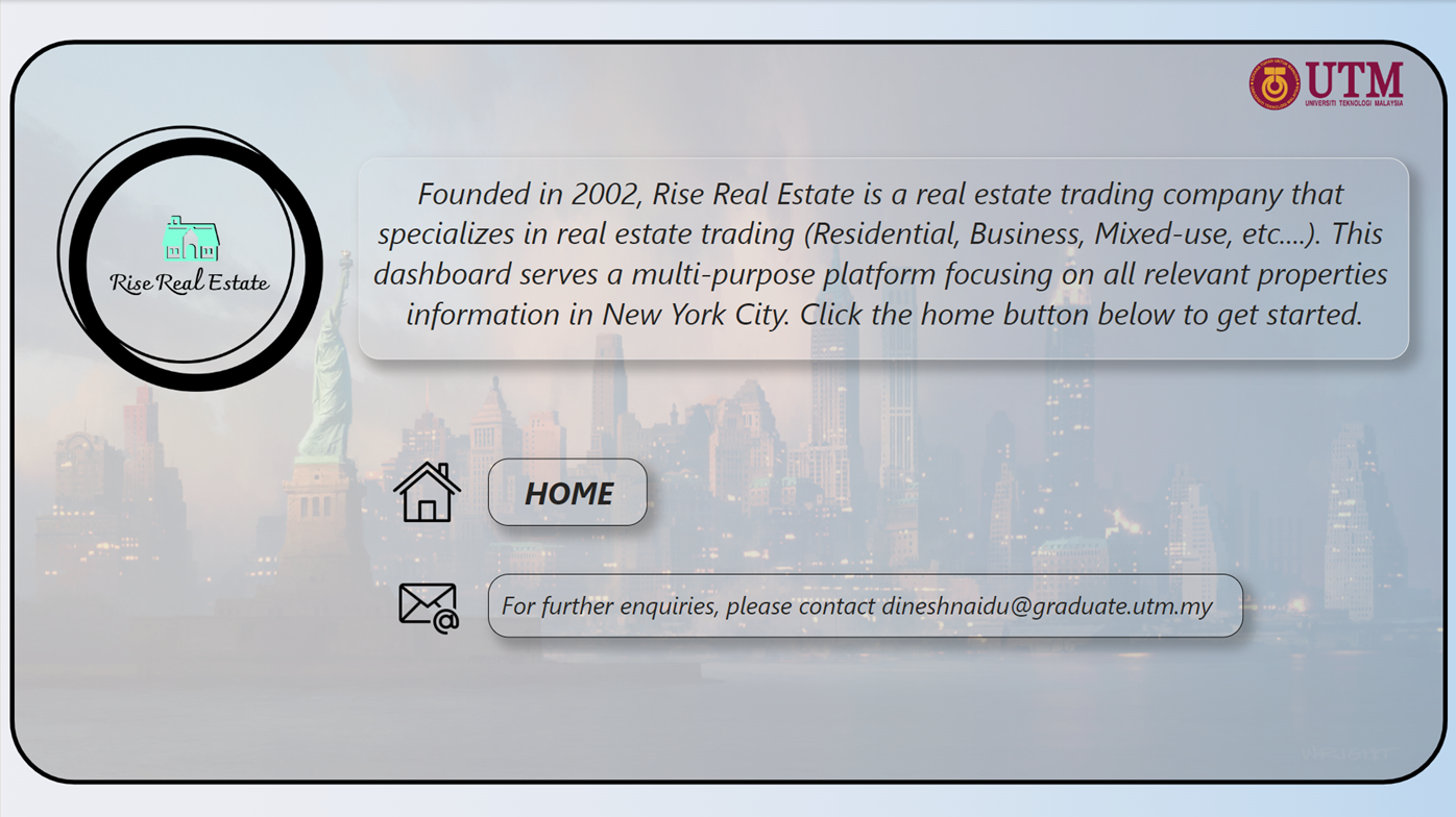 Figure 12: Cover Page of Dashboard
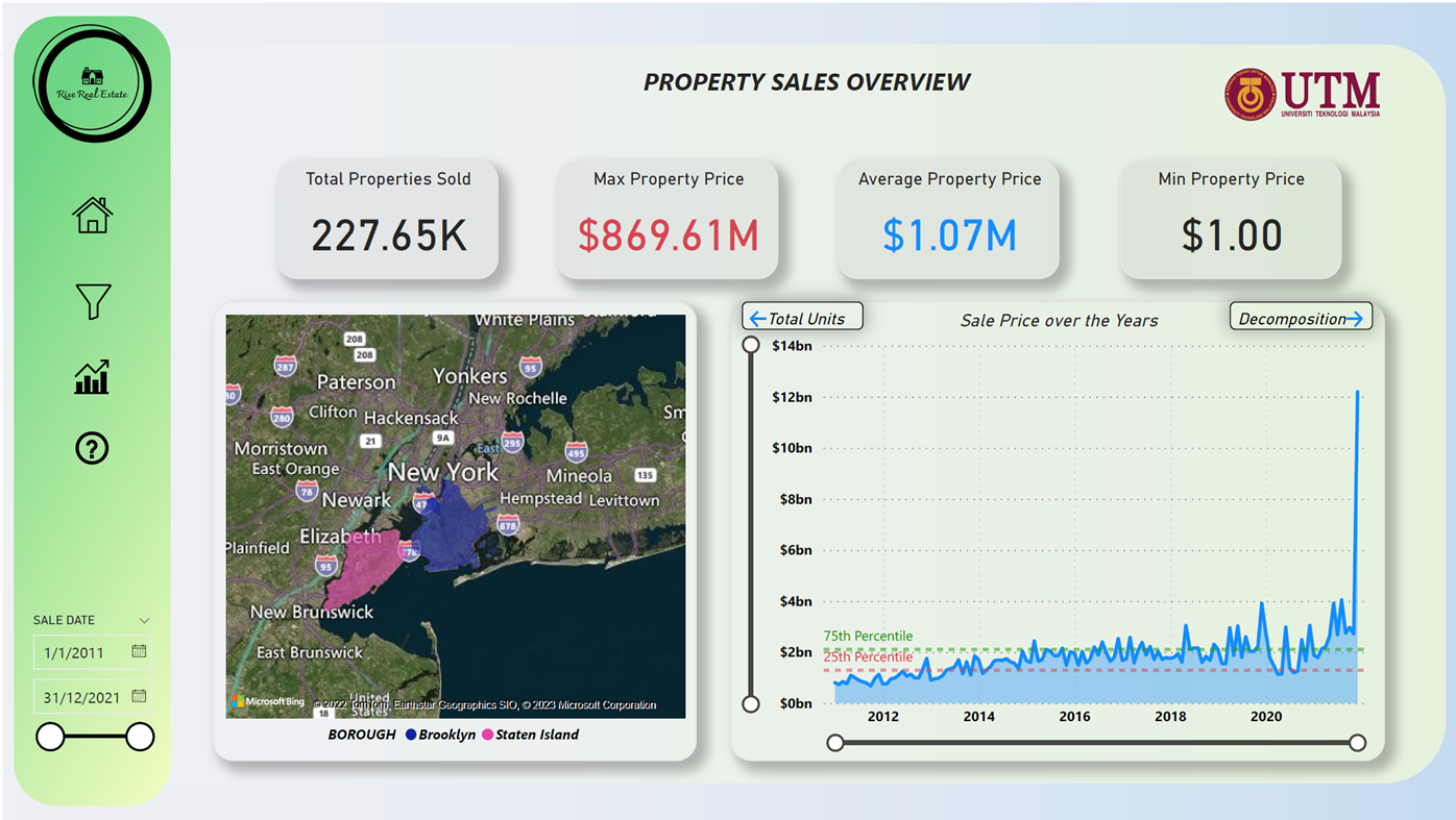 Figure 13: Home Page of Dashboard
A light green colour in Figure 13 is chosen as the main theme of the dashboard and is consistent in rest of the dashboard pages. This colour choice was in fact a conscious one as the use of a light green colour theme in a dashboard can provide several benefits, such as:
Calming effect: Light green is a soothing colour that can have a calming effect on users, making it easier for them to focus on the data presented on the dashboard.
Conveys growth and success: Light green is often associated with growth and success, making it a good choice for dashboards that track financial or business performance.
Enhances readability: Light green is a light color that does not strain the eyes and can enhance the readability of the data presented in the dashboard.
The design of the dashboard also includes additional illumination on areas that need special focus on. For example, in Figure 13, the maximum value is presented in red to stress its importance. Adding to that, every single logo or image is labelled with a tooltip which allows a use to hover their mouse and get a quick information on its meaning. The aesthetic of a dashboard also needs to align with the company’s branding and identity, as it will help to present a professional and cohesive look to the stakeholders. In essence, a good design aesthetic in a dashboard sense is one that is visually appealing, easy to understand, and helps users to quickly identify important information. It should also align with the company’s branding and identity.
Choice of Visualization
There are 4 main visualizations that are used in this dashboard to present data which are,
1. Line/Area Chart
A line chart is a type of chart that is used to display quantitative data. The main benefits of using a line chart include:
- Clarity: Line/Area charts are easy to read and understand, making it simple to identify trends and patterns in the data.
- Comparability: Line/Area charts can be used to compare multiple sets of data, as multiple lines can be displayed on the same chart.
- Time-based data: Line/Area charts are often used to display data that changes over time, which allows for easy identification of trends and patterns over a specific period.
- Space efficient: Line/Area charts can be used to display a large amount of data in a small space, which is useful for presentations and reports.
Line/Area charts that are used in this dashboard is used to show sale price trend, CPI rates trend, CPI rates forecast, CPI rates anomalies, interest rates trend, interest rates forecast, interest rates anomalies, unemployment rates trend, unemployment rates forecast, unemployment rates anomalies, population forecast, population anomalies, sales price/sq ft. trend, sales price/sq ft. forecast and sales price/sq ft. anomalies. Example of line/area chart used in this dashboard is shown in Figure 14.
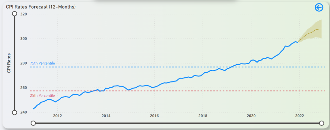 Figure 14: Example of Line/Area Chart in the Dashboard
2. Decomposition Tree Chart
A decomposition tree chart is a type of chart that is used to display hierarchical data. The main benefits of using a decomposition tree chart include:
- Organization: Decomposition tree charts provide a clear and organized way to display hierarchical data, making it easy to understand the relationships between different levels of data.
- Drill-down analysis: Decomposition tree charts allow for drill-down analysis, which means that users can click on a specific node in the chart to view more detailed information.
- Navigation: Decomposition tree charts allow users to navigate through the data in a logical and intuitive way, making it easy to find the information they need.
- Large data: Decomposition tree charts are useful for displaying large amounts of data, as they allow users to zoom in and out to view different levels of detail.
- Flexibility: Decomposition tree charts can be used to display a wide range of data types, including quantitative, categorical and ordinal data.
Decomposition tree chart that is used in this dashboard is the breakdown of sale price which allows the user to go several levels (borough, neighbourhood, building class category, block) down into the breakdown of sale prices. The screenshot of the decomposition tree chart is depicted in Figure 15.
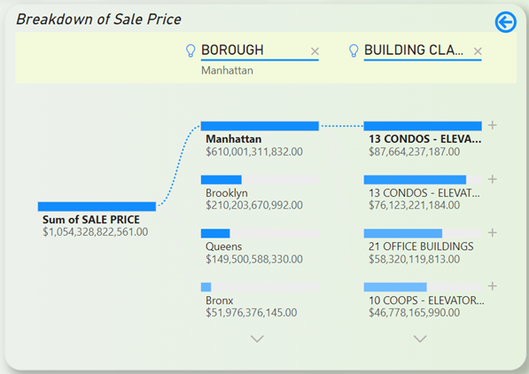 Figure 15: Decomposition Tree Chart in the Dashboard
3. Clustered Column Chart
A clustered column chart is a type of chart that is used to display quantitative data and the advantages of using a clustered column chart include:
- Comparison: Clustered column charts allow for easy comparison of multiple sets of data, as the columns can be grouped together by category.
- Trends: Clustered column charts make it easy to identify trends and patterns in the data, as the columns can be stacked to show changes over time.
- Space efficiency: Clustered column charts can be used to display a large amount of data in a small space, which is useful for presentations and reports.
- Clarity: Clustered column charts are easy to read and understand, making it simple to identify relationships between different sets of data.
Clustered column chart that is used in this dashboard is to show the population by borough trend. The screenshot of the clustered column chart is shown in Figure 16.
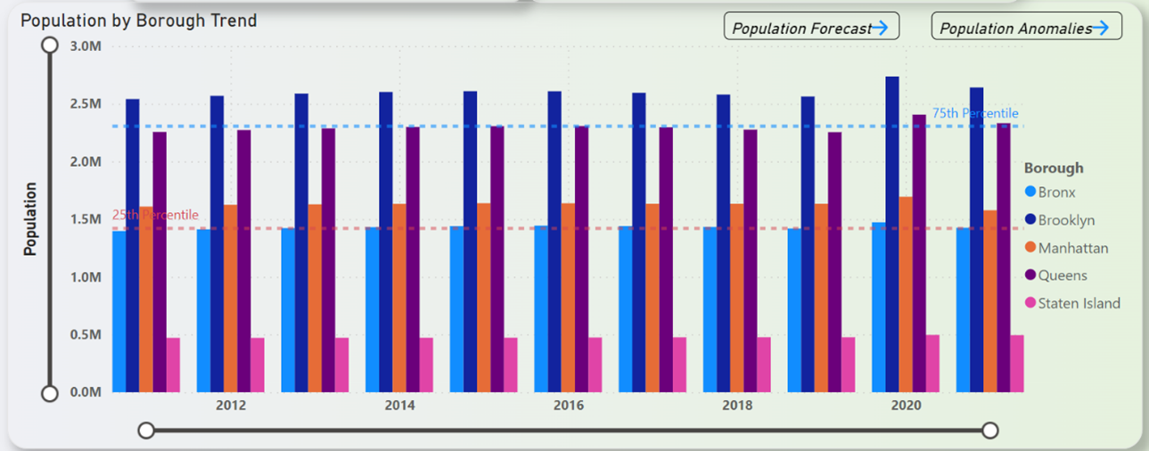 Figure 16: Clustered Column Chart in the Dashboard
4. Waterfall Chart
A waterfall chart is a type of chart that is used to display data that changes sequentially, such as financial data or inventory levels. The main benefits of using a waterfall chart include:
- Identifying the impact of individual items: Waterfall charts make it easy to see the impact of individual items on the overall total, such as how a change in a specific expense affects the bottom line.
- Seeing the cumulative effect: Waterfall charts allow users to see the cumulative effect of all the items in the data set, making it easy to understand how different items are contributing to the overall total.
- Highlighting positive and negative changes: Waterfall charts use color coding to highlight positive and negative changes in the data, making it easy to identify areas of growth or decline.
- Easy to understand: Waterfall charts are easy to read and understand, making it simple to identify trends and patterns in the data.
Waterfall chart used in this dashboard is used to show the year-over-year percentage changes in sale price. This chart can also be drilled down to quarters and months. The screenshot of the waterfall chart is depicted in Figure 17.
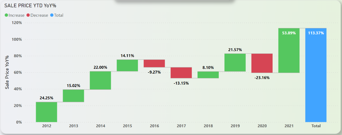 Figure 17: Waterfall Chart in the Dashboard
Data Analysis
Descriptive Analytics – NYC Property Sales
Figure 18 shows the sum of property sales in NYC from 2011 to 2021. From Figure 18 it is understood that over the years, property sales usually floats and fluctuates between the 50th Percentile but in 2020, the sales took a massive dip below the 25th Percentile line. From Figure 17 it is observed that the mentioned dip was a staggering -23.16%. It took almost a full year for the property sales market to recover and exceed the 75th Percentile line, and the recorded increase was the highest positive change in the whole property sales dataset. From Figure 17, the exact number for the increase in sales from 2020 to 2021 is 53.89%. In the span of just 11 years from 2011-2021, the property sales market in NYC has grown 113.37% bigger.
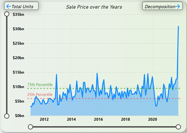 Figure 18: Sum of Property Sales in NYC Trend (2011-2021)
Descriptive Analytics – CPI Rates
Figure 19 depicts the CPI rates trend in NYC over the years from 2011 to 2021. From Figure 19, it can be inferred that the CPI rates seems to be rising at a steady rate with no signs of a massive drop. With a few minor dips over the years, the number keeps on growing.
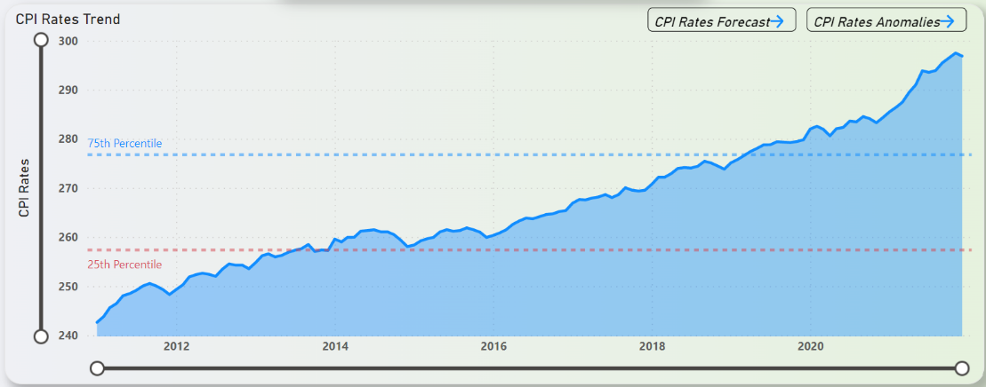 Figure 19: CPI Rates in NYC Trend (2011-2021)
Descriptive Analytics – Federal Interest Rates
Figure 20 shows the federal interest rates trend over the years from 2011 to 2021. From Figure 20 it is understood that, from year 2011, the interest rates was hovering around in close proximity with the 25th Percentile and was beginning to show a rising pattern from 2016 onwards. This rising pattern carried on until 2017 where it managed to exceed the 75th Percentile line and kept on rising. This rising pattern did not carry on for long and lasted for about 3 years before plummeting below the 25th percentile line in 2020 where it still is almost 1 year later.
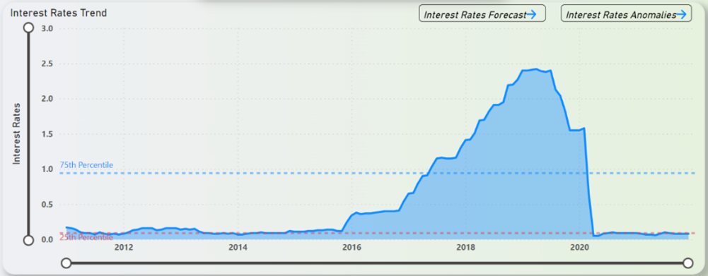 Figure 20: Federal Interest Rates Trend (2011-2022)
Descriptive Analytics – Unemployment Rates
Figure 21 depicts the unemployment rates trend in NYC over the years from 2011 to 2021. From Figure 21 it can be inferred that unemployment rates was healthily declining from 2011 indicating a good workforce in NYC and 2018 saw the rates dip below the 25th Percentile line. In 2020 however, the numbers began to spike up. The rates difference in just a month from March-2020 to April-2020 was a staggering 315% increase. Since that rise, the rates look to be declining at a steady pace and looks to be very close to the 25th Percentile line towards the end of 2021.
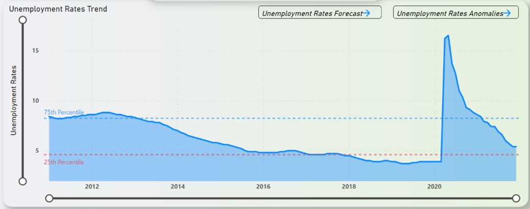 Figure 21: Unemployment Rates in NYC Trend (2011-2021)
Descriptive Analytics – NYC Population Estimates
Figure 22 shows the NYC population estimates trend by borough over the years from 2011 to 2021. From Figure 22, on the perspectives of boroughs, it can be understood that Brooklyn hosts the highest number of people in NYC with about 2.5million and on the opposite side of the spectrum is Staten Island with the least number of people which is around 0.5million. One major thing to note here is that the chart seems to show no difference across the timeframe of 11 years. The ranking seems to be consistent with no one borough overtaking the other in terms of number of peoples. The mentioned ranking in terms of highest to lowest are as below,
- Brooklyn
- Queens
- Manhattan
- Bronx
- Staten Island
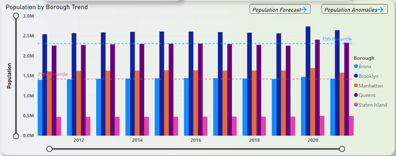 Figure 22: NYC Population Estimates Trend by Borough (2011-2021)
Diagnostic Analytics – NYC Property Sales
The major observation from NYC Property Sales as in Figure 18 was the -23.16% sales dip in 2020. The most obvious answer here is property sales in NYC dropped in 2020 due to the COVID-19 pandemic, which caused widespread economic uncertainty and job losses. Supporting this notion is the rise in unemployment rates in 2020 as shown in Figure 21 and the drop in federal interest rates in 2020 as depicted in Figure 20. This resulted in many people postponing their plans to buy or sell property, leading to a decrease in overall sales. Additionally, restrictions on in-person showings and the closure of many businesses made it more difficult for buyers and sellers to complete transactions. The lockdowns also caused many people to re-evaluate their housing needs, with some opting to leave the city for more space or lower costs.
Predictive and Prescriptive Analytics
The distinction between predictive and prescriptive analytics is that predictive analytics uses historical data, statistical algorithms and machine learning techniques to identify the likelihood of future outcomes based on historical patterns with the end goal of predicting future events. Prescriptive analytics on the other hand goes one step further than predictive analytics by suggesting specific actions or decisions to take based on the predictions with the end goal of optimizing future outcomes.
For the purposes of this project, predictive analytics is performed using the historical data of the primary data (NYC Property Sales) to forecast the sales for a period of 12-months via the in-built forecasting tool in Power BI. It is possible to perform the predictive analysis by the method of a machine learning (ML) regression model which utilizes the combination of the secondary data to predict the sales prices. For the purposes of this project, this method is strongly advised not to, because of the evidence presented in Figure 9 and Figure 10 that shows the secondary data has weak and negligible correlation with the primary data. Any effort to develop a ML model based on these data might prove to be futile. Using the forecasted data, prescriptive analytics shall be performed by recommending key insights that the stakeholders in RRE might benefit from.
Predictive Analytics – Forecasting Results
The property sales trend by borough over the years from 2011 to 2021 and coupled with the property sales forecast by borough from 2021 to 2022 is shown in Figure 23.
 Figure 23: NYC Property Sales Forecast (12-Months)
From Figure 23, it is forecasted that the property sales in 2022 will be well above the 75th percentile line with some minor fluctuations. To drill down the sales by borough, it is shown that Manhattan would bring in the most sales and maxing at around the $12 billion dollars mark. On the opposite end of the spectrum, the borough that is forecasted to bring in the least amount of sales is Staten Island which maxed out at around $560 million dollars. That is about 12 times smaller than the property market in Manhattan. The property sales forecast for both Manhattan and Staten Island is depicted in Figure 24 and Figure 25.
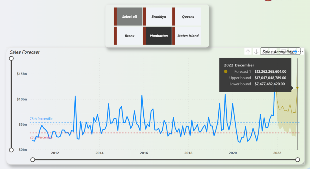 Figure 24: Manhattan Property Sales Forecast (12-Months)
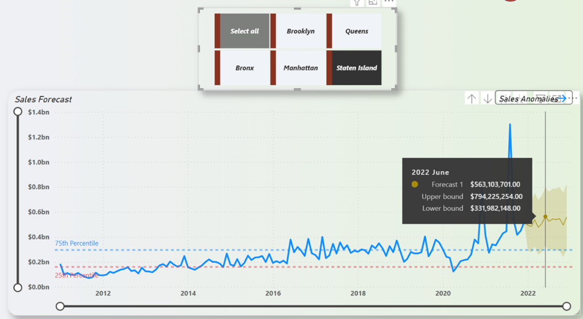 Figure 25: Staten Island Property Sales Forecast (12-Months)
It must also be addressed here that towards the end of 2021, it is noticeable that the property sales took a massive spike upwards to around the $30 billion mark and is in fact the highest recorded sales amount in an 11-year span. This point might prove to be an anomaly with the property market possibly beginning to recover and capitalizing while they can. This is further highlighted in the anomaly study that is shown in Figure 26.
 Figure 26: NYC Property Sales Anomalies
As shown in Figure 26, the difference between the actual value and the expected value is around more than 100% which is a staggering number in itself. This forecasting and anomaly study is not only exclusive for the primary data, but for the secondary data as well which is shown in the following figures.
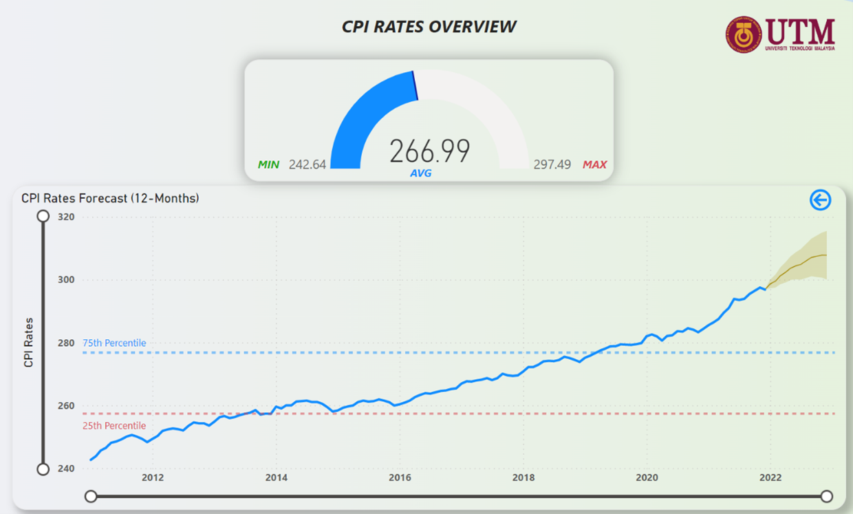 Figure 27: CPI Rates Forecast (12-Months)
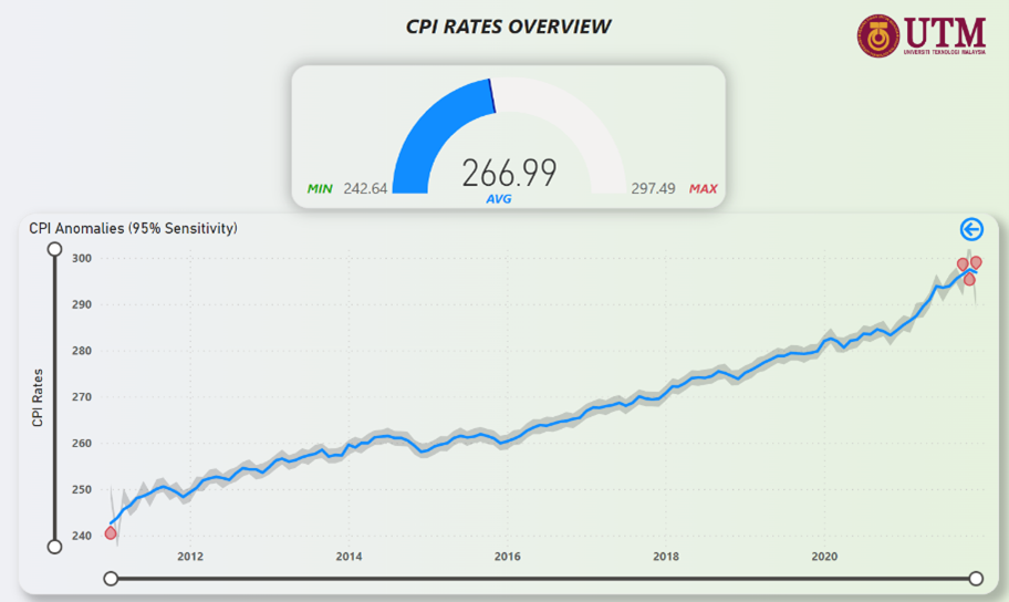 Figure 28: CPI Rates Anomalies
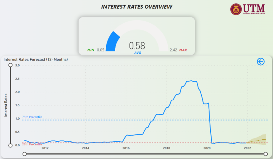 Figure 29: Federal Interest Rates Forecast (12-Months)
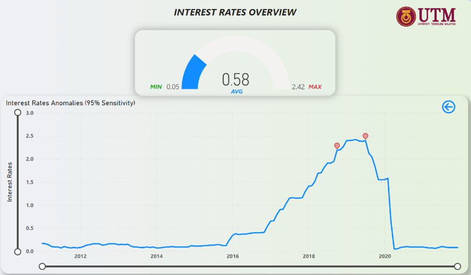 Figure 30: Federal Interest Rates Anomalies
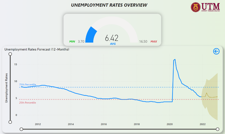 Figure 31: Unemployment Rates Forecast (12-Months)
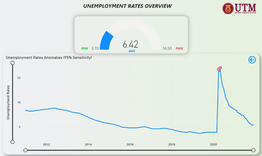 Figure 32: Unemployment Rates Anomalies
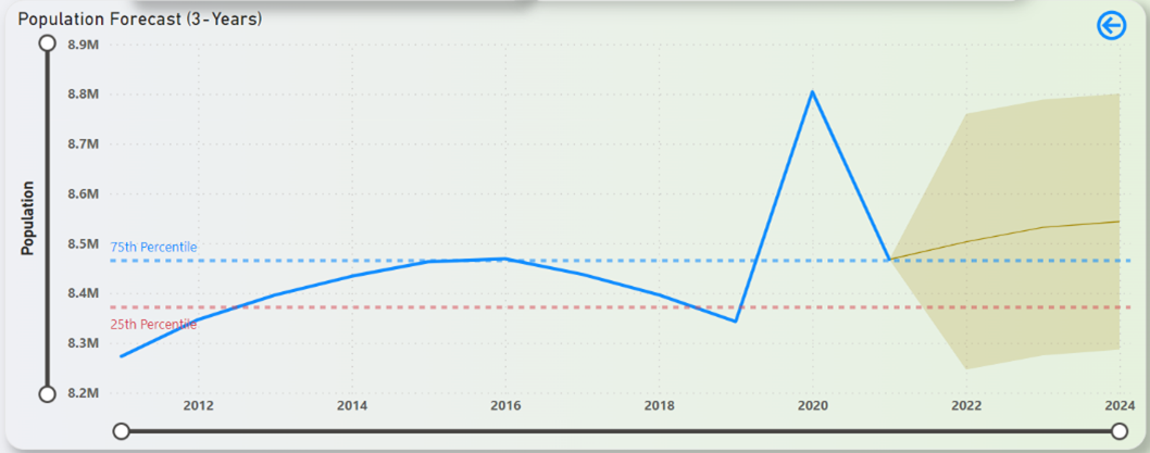 Figure 33: NYC Population Forecast (3-Years)
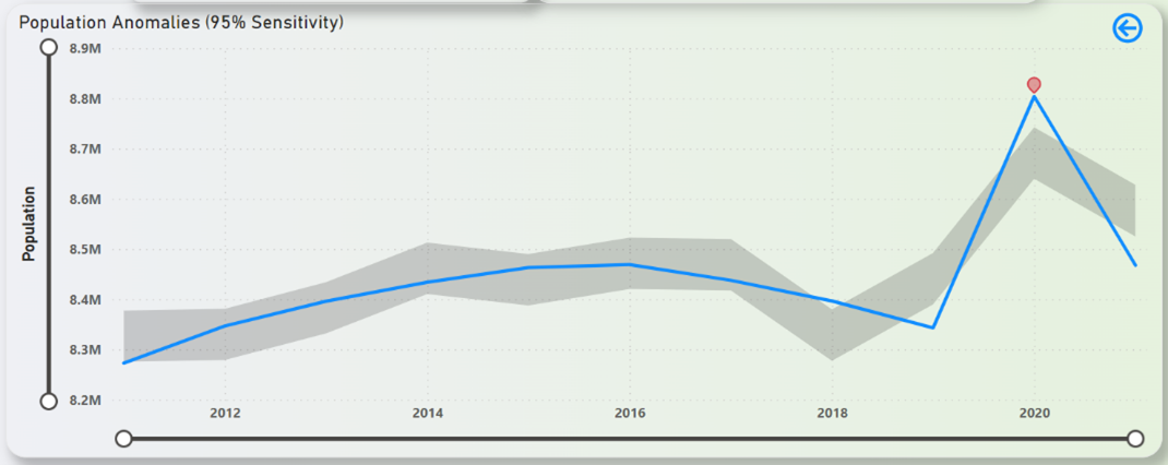 Figure 34: NYC Population Anomalies
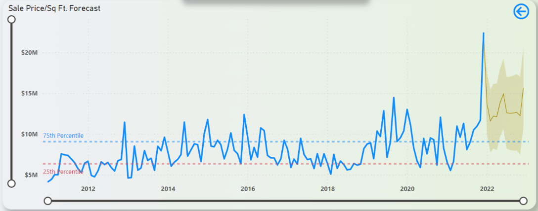 Figure 35: Sale Price/Sq Ft. Forecast (12-Months)
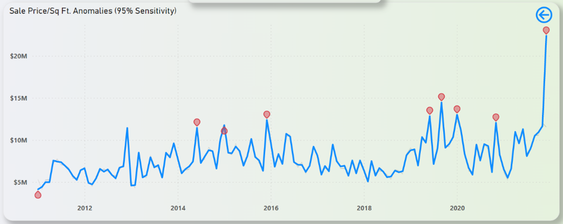 Figure 36: Sale Price/Sq Ft. Anomalies
Some key insights that can be gained from the forecasts in the Figures above are that CPI rates looks to rise steadily, federal interest rates can be expected to rise above the 25th Percentile mark, unemployment rates will face a minor fluctuation but ultimately hover close to the 25th Percentile line, and the population in NYC can be expected to grow steadily over the next 3 years.
Prescriptive Analytics – Recommendation of Insights
The information that was gained during the predictive analytics stage can be channelled to RRE here via prescriptive analytics. The insights that can be recommended to RRE are as follows,
- Move aggressively in property trading focused in Manhattan borough. They are forecasted to bring in the maximum property sales. Might be a good idea to focus on short term sales and bringing in maximum sales.
- Staying on the topic of Manhattan, we can deduce that if that property sales are the maximum there, it means that countless of peoples are regularly looking for properties. This could be taken advantage of in the form of rental properties which could generate a steady cash flow.
- By drilling down into Manhattan and via the help of the decomposition tree chart in Figure 37, we can observe that it is best to trade in condos/elevator apartments situated in Midtown West neighbourhood and to be more exact, in block 1030.
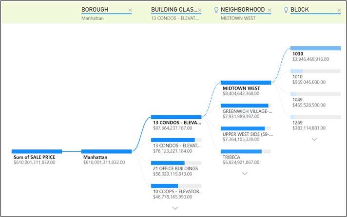 Figure 37: Decomposition Tree Chart of Property Sales in Manhattan
- Property trading based in Staten Island borough must be kept to a minimal as it is the one with the least sales and activities there looks to be stagnant. Might be a good idea to focus on long term deals around this area as opposed to short term deals.
- Federal interest rates are expected to rise soon which can slow down economic growth, which also translates to less people trading in properties. It might be a good idea to be highly active in property trading during the beginning of 2022 before the rates gets substantially higher.
Discussion
Beginning with the business problem formulation and understanding, this project has explored the stakeholders, various data sources and its subsequent processes (data cleaning, data integration), processes involved in the data storytelling, aesthetics and choices of visualization in the dashboard, and the various data analytics (descriptive, diagnostic, predictive, prescriptive).
As mentioned previously, no technology is ever perfect on its first iteration and this project is not an exception to that. There is always room for improvement with the most obvious one being the heart of the dashboard itself, its data. As depicted in Figure 9 and Figure 10, the secondary data has weak and negligible correlation with the primary data. With a more concrete secondary data source, it is possible to develop a ML model that could predict the sales price with a high degree of accuracy. Expanding into that, the location of a property is a crucial factor in determining its value and potential for appreciation. Properties in desirable neighbourhoods, such as those with good schools, low crime rates, and easy access to public transportation, tend to command higher prices and be more stable investments. Crime rates data around NYC could potentially be a good supplementing data source for the next iteration.
The dashboard developed in this project employed many features and interactivity options in Power BI with the main ones being bookmarks, slicers, tooltips, zooming, drill-down, forecasting and anomaly detection. Some advanced features such as ‘Q&A’ (allows a user to get an answer from the data by asking a question using natural language) is consciously left out from the dashboard as it has the potential to add clutter to the dashboard and might bring in more confusion than answers. While the dashboard in this project relied on manual data integration from various sources, future iterations of this dashboard could easily automate data collection and analysis, reducing the time and resources required to gather and process information. Additional features could also include customer interactions and provide real-time data on customer satisfaction, which would help the company to improve its customer retention. It must also be mentioned here that to truly track the effectiveness of this dashboard, a sales comparison for before and after implementation of dashboard should be carried out.
It can be concluded that the goal set in this project to develop and deploy a dashboard that acts as a BI solution that can assist in deriving quick actionable insights is achieved. The key insights garnered are to act quickly in the property market focused in Manhattan before the federal interest rates rises and place less importance on the property market in Staten Island.
The raw dataset, Python scripts to clean the dataset and the cleaned data in .csv mentioned in this article are hosted in my Github Repo. Should anyone require the Power BI dashboard file of this project, you may do so by requesting it via Linkedin.