
The following article shows the process on performing unsupervised learning on Telco Churn data. The datasets used in this project are from Kaggle should you want to follow along.The following processes assumes that the necessary data preparation steps are performed. The complete Python notebook for this project is hosted in my Github Repo.
K-Means Clustering (Partition-Based Clustering)
Figure 1 shows the graph of the distortion score elbow for K-Means clustering. In order to find an appropriate number of clusters, the elbow method is used. In this method for this case, the inertia for a number of clusters between 2 and 10 will be calculated. The rule is to choose the number of clusters where you see a kink or “an elbow” in the graph. The graph also shows that the reduction of a distortion score as the number of clusters increases. However, there is no clear “elbow” visible. The underlying algorithm suggests 4 clusters. Hence, the choice of four or five clusters seems to be fair.
1
2
3
4
5
6
7
8
#Visualizing the elbow method
X = df2.values[:,:]
model = KMeans(random_state=1)
visualizer = KElbowVisualizer(model, k=(2,10))

visualizer.fit(X)
visualizer.show()
plt.show()
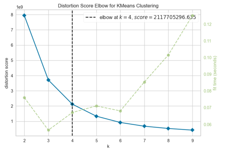 Figure 1: Distortion Score Elbow for K-Means Clustering
There is another way to choose the best number of clusters which is by plotting the silhouette score in a function of a number of clusters. Figure 2 shows the silhouette coefficient in the elbow chart.
1
2
3
4
5
6
7
#Implementing silhoutte coefficient in the elbow chart
model = KMeans(random_state=1)
visualizer = KElbowVisualizer(model, k=(2,10), metric='silhouette')

visualizer.fit(X)
visualizer.show()
plt.show()
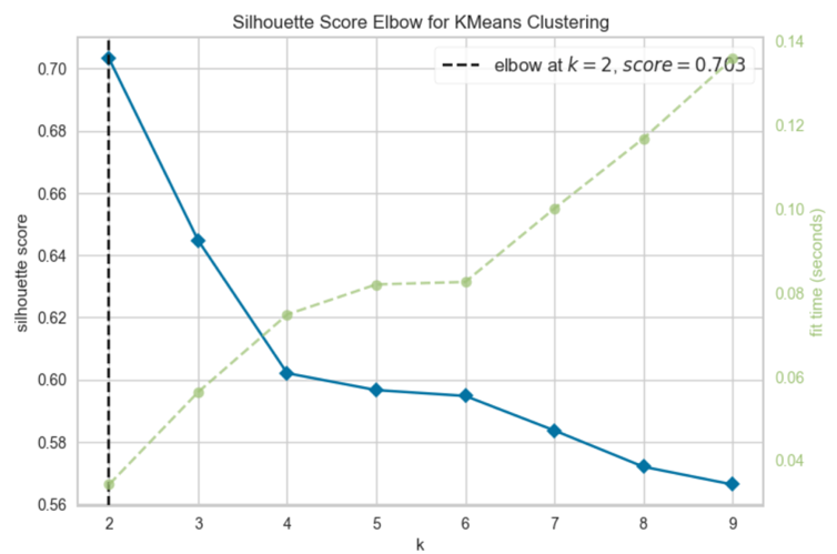 Figure 2: Silhouette Score Elbow for K-Means Clustering
The algorithm is fit using the two clusters as suggested by Figure 2. A new dataframe is then created to get the relationship between the K-mean labels and mean of the data.
1
2
3
4
KM_clusters = KMeans(n_clusters=2, init='k-means++').fit(X)
labels = KM_clusters.labels_
df2['KM_Clus'] = labels
df3 = df2.groupby('KM_Clus').mean()
The clusters are visualized by the scatter plot of Monthly Charges vs Tenure. Unfortunately, the clusters did not show any clear signs of relationship between each other.
1
2
3
4
5
6
7
8
#Visualizing the clusters in Tenure vs Monthly Charges
plt.scatter(df2.iloc[:, 4], df2.iloc[:, 7],
            c=labels.astype(np.float),
            alpha=0.5, cmap='viridis')
plt.xlabel('Tenure', fontsize=18)
plt.ylabel('Monthly Charges', fontsize=16)

plt.show()
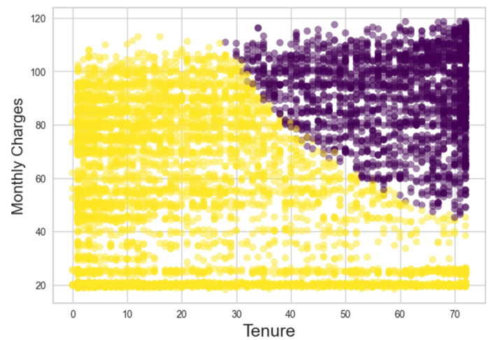 Figure 3: Scatter Plot For Clusters in Monthly Charges Vs Tenure
In terms of the clusters themselves, their quality can be checked by plotting silhouette of K-means clustering for 7043 samples in two centers as shown in Figure 4. A silhouette score ranges from -1 to 1, with higher values indicating that the objects well matched to its own cluster and are further apart from neighboring clusters. For cluster 0, the silhouette score is around 0.85 while the silhouette score for cluster 1 is around 0.72. Good silhouette scores demonstrated here indicates that both of them are in a good quality.
1
2
3
4
5
6
from yellowbrick.cluster import SilhouetteVisualizer
model = KMeans(n_clusters=2, random_state=0)
visualizer = SilhouetteVisualizer(model, colors='yellowbrick')
visualizer.fit(X)
visualizer.show()
plt.show()
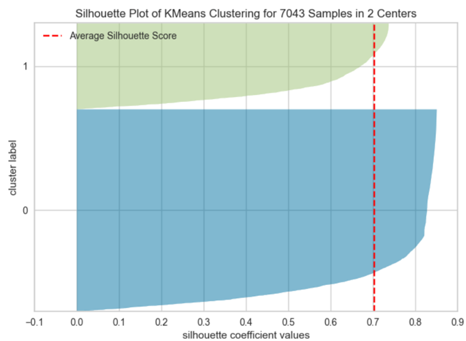 Figure 4: Silhouette Plot of K-Means Clustering for 7043 Samples in 2 Centres
DBSCAN (Density-Based Clustering)
It is difficult arbitrarily to say what values of epsilon and min_samples will work the best. Therefore, a matrix of investigated combinations is created first.
1
2
3
4
eps_values = np.arange(8,12.75,0.25) # eps values to be investigated
min_samples = np.arange(3,10) # min_samples values to be investigated

DBSCAN_params = list(product(eps_values, min_samples))
Because DBSCAN creates clusters itself based on those two parameters, the number of generated clusters based on the parameters from the previous step is collected.
1
2
3
4
5
6
7
no_of_clusters = []
sil_score = []

for p in DBSCAN_params:
    DBS_clustering = DBSCAN(eps=p[0], min_samples=p[1]).fit(X)
    no_of_clusters.append(len(np.unique(DBS_clustering.labels_)))
    sil_score.append(silhouette_score(X, DBS_clustering.labels_))
A heatplot shows how many clusters were generated by the DBSCAN algorithm for the respective parameters combinations as in Figure 5 below.
1
2
3
4
5
6
7
8
9
10
tmp = pd.DataFrame.from_records(DBSCAN_params, columns =['Eps', 'Min_samples'])
tmp['No_of_clusters'] = no_of_clusters

pivot_1 = pd.pivot_table(tmp, values='No_of_clusters', index='Min_samples', columns='Eps')

fig, ax = plt.subplots(figsize=(15,6))
sns.heatmap(pivot_1, annot=True,annot_kws={"size": 8}, cmap="YlGnBu", ax=ax)
ax.set_title('Number of clusters')
plt.tight_layout()
plt.show()
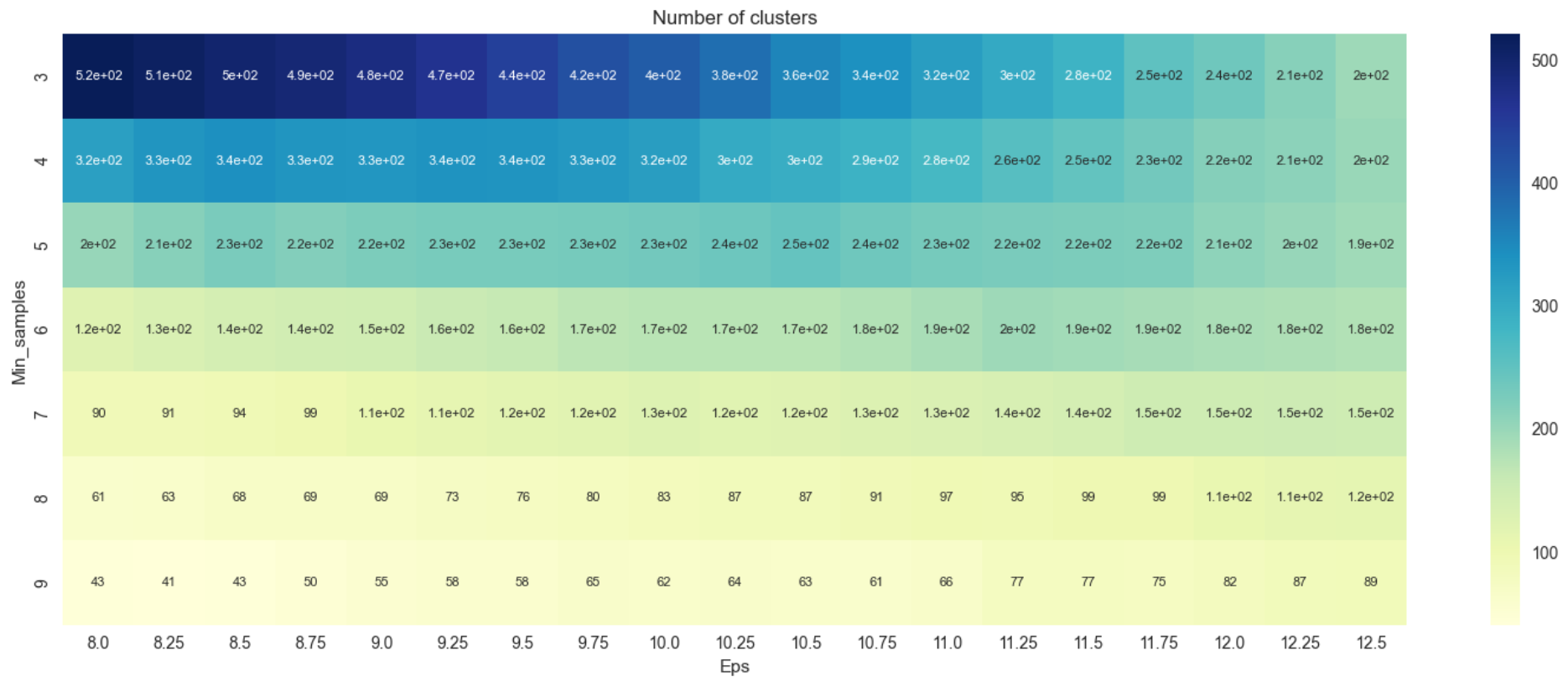 Figure 5: Heatmap Version 1
Heatplot from Figure 5 shows the number of clusters varies greatly with the minimum number of clusters of 43 and the maximum at about 520. A silhouette score is plotted as a heatmap to decide which combination of epsilon and minimum density threshold to choose.
1
2
3
4
5
6
7
8
9
tmp = pd.DataFrame.from_records(DBSCAN_params, columns =['Eps', 'Min_samples'])
tmp['Sil_score'] = sil_score

pivot_1 = pd.pivot_table(tmp, values='Sil_score', index='Min_samples', columns='Eps')

fig, ax = plt.subplots(figsize=(18,6))
sns.heatmap(pivot_1, annot=True, annot_kws={"size": 10}, cmap="YlGnBu", ax=ax)
plt.tight_layout()
plt.show()
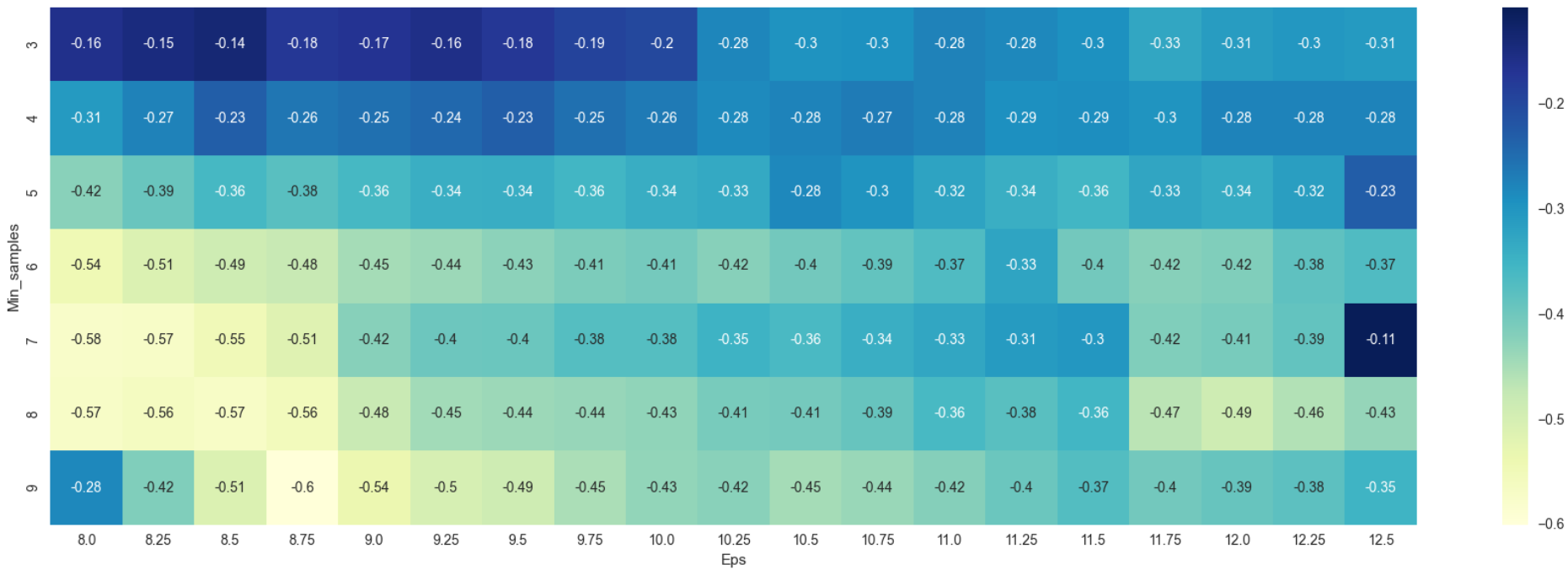 Figure 6: Heatmap Version 2
According to silhouette value conventions, values near +1 indicates that the samples are far away from the neighboring clusters while a value of 0 indicates that the sample is on or very close to the decision boundary between 2 neighboring clusters. Negative values on the other hand indicates that samples might have been assigned to the wrong cluster. From Figure 6, resulting silhouette values are all in negative which indicates that something is either wrong with the data or the algorithm chosen itself. The model is trained again using only continuous variables to check whether there is something wrong with the data. All binary data and one-hot encoded data are omitted. The processes for DBSCAN from step 1 to 4 are repeated.
1
2
3
4
5
6
7
8
9
10
11
12
13
14
15
16
17
18
19
20
21
22
df4 = df[['tenure', 'MonthlyCharges', 'TotalCharges']]
X = df4.values[:,:]

no_of_clusters = []
sil_score = []

for p in DBSCAN_params:
    DBS_clustering = DBSCAN(eps=p[0], min_samples=p[1]).fit(X)
    no_of_clusters.append(len(np.unique(DBS_clustering.labels_)))
    sil_score.append(silhouette_score(X, DBS_clustering.labels_))

#Visualize the number of clusters for the updated criterias
tmp = pd.DataFrame.from_records(DBSCAN_params, columns =['Eps', 'Min_samples'])
tmp['No_of_clusters'] = no_of_clusters

pivot_1 = pd.pivot_table(tmp, values='No_of_clusters', index='Min_samples', columns='Eps')

fig, ax = plt.subplots(figsize=(15,6))
sns.heatmap(pivot_1, annot=True,annot_kws={"size": 8}, cmap="YlGnBu", ax=ax)
ax.set_title('Number of clusters')
plt.tight_layout()
plt.show()
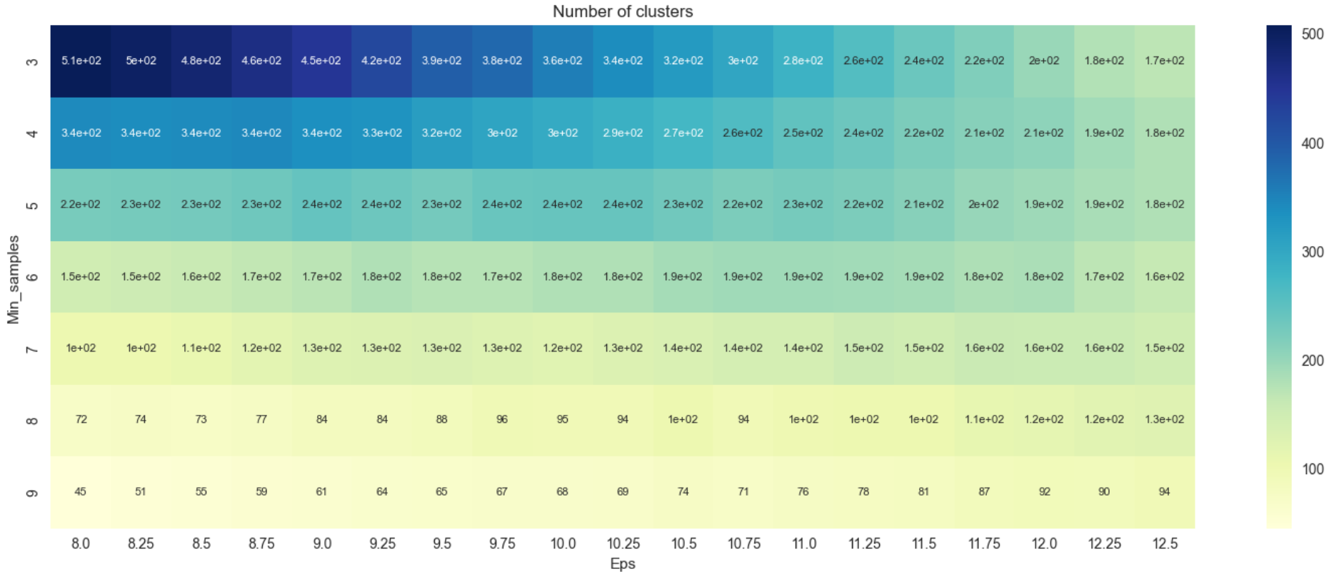 Figure 7: Heatmap Version 3
From Figure 7, there seems to be no major difference in the number of clusters that was derived earlier in Figure 5. The heatmap of silhouette scores for the updated criteria are visualized.
1
2
3
4
5
6
7
8
9
10
#Visualize the heatmap of silhuette scores for the updated criteria
tmp = pd.DataFrame.from_records(DBSCAN_params, columns =['Eps', 'Min_samples'])
tmp['Sil_score'] = sil_score

pivot_1 = pd.pivot_table(tmp, values='Sil_score', index='Min_samples', columns='Eps')

fig, ax = plt.subplots(figsize=(18,6))
sns.heatmap(pivot_1, annot=True, annot_kws={"size": 10}, cmap="YlGnBu", ax=ax)
plt.tight_layout()
plt.show()
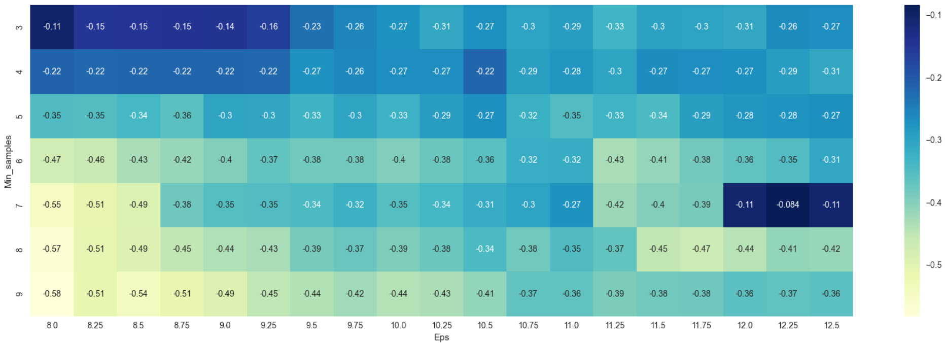 Figure 8: Heatmap Version 4
As was in Figure 6, Figure 8 too produced negative values which are indicative that the dataset is not suitable for DBSCAN as no apparent number of clusters can be generated. In essence, silhouette scores rewards clustering where points are very close to their assigned centroids and far from other centroids (good cohesion and good separation). Negative scores here could be taken to mean that the algorithm could not distinguish the presence of clear and obvious clusters in the data. A scatterplot of Monthly Charges vs Tenure is visualized to show that there are no apparent clusters that can be derived.
1
2
3
4
5
#Scatterplot of Tenure vs Monthly Charges
plt.scatter(df4['tenure'], df4['MonthlyCharges'])
plt.xlabel('Tenure', fontsize=18)
plt.ylabel('Monthly Charges', fontsize=16)
plt.show()
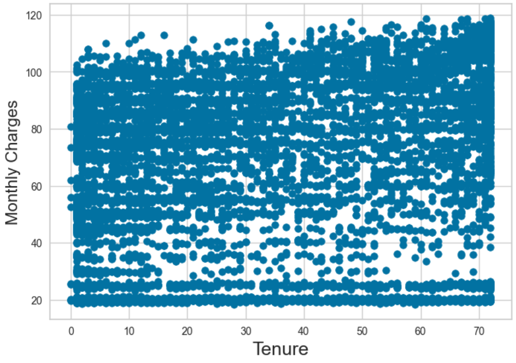 Figure 9: Scatterplot of Monthly Charges Vs Tenure
Performance Comparison (K-Means vs DBSCAN)
As was explored in the 2 sections above, K-Means model resulted in 2 clusters with a silhouette score of 0.703 while DBSCAN model did not result in any meaningful number of clusters and silhouette scores. This could be explained by the fact that K-Means require the number of clusters as input from the user which generally means that more than 1 cluster is possible to be derived. DBSCAN fundamentally on the hand does not need number of clusters to be specified and it locates regions of high density that are separated from one another by regions of low density. Since the majority of the data is densely populated as a whole, DBSCAN is unable to detect any apparent clusters in the dataset and is an unsuitable choice of clustering algorithm for this dataset. K-Means on the other hand proves to be a good clustering algorithm for this dataset with a silhouette score of 0.703 (close to +1). But 2 key points has to be addressed here which are:
Although 2 clusters are derived, no clear and apparent relationship or interesting insights could be derived from them. Plotting most of the features on a scatterplot against each other would be of minimal use as most data is either binary or numerical label which would not transmit any visual information on the presence of clusters.
The number of clusters are user defined, and for this case, additional number of clusters with a hit on the silhouette score is possible but there is no guarantee of generating useful insights as the data is tightly packed together as a whole.
The dataset and Python notebook for the unsupervised learning mentioned in this article is hosted in my Github Repo.