
The following article is a part of my Statistics for Data Science Project executed completely in R. Requirements of the project included finding a relatively large dataset and assuming a scenario to perform data analysis on it.
Background
Twitch is a live streaming platform owned by Amazon. When Twitch launched back in 2011, most of the content on the platform was video games, live streaming, and eSports competitions with a growing number of streams in music, DIY, creative, and lifestyle content. Today, Twitch is the world’s largest streaming Website with more than 15 million daily active users. The dataset consists of the top 200 games on Twitch on each month from January 2016 to December 2021. The scenario for this project is as below,
“Video games is a booming industry worth billions that is still yet to be fully capitalized and a billionaire based in Malaysia whose name will be kept confidential for now has requested our help at an analytics firm to advise on which games to invest in. Our firm has decided to get the relevant statistics from the streaming platform, Twitch, to run some analysis. In finding the best games to invest in, we will particularly investigate the most top ranked game, top ranked games by year, relative frequency of average viewers ratio by month, average peak channels of the game Valorant in 2021, average viewer ratio of the game League of Legends per month, whether mean hours watched of games is more than 4.5 million hours and whether there is a difference in the peak viewers for 3 different years. All these questions should be sufficient in deciding the most valuable games to invest in by the billionaire.”
Data Collection
The dataset used in this project is “Twitch Game Ranking” that has been obtained from an open-source website for open dataset, Kaggle. The dataset consists of 14, 400 rows and 12 columns. There are 200 different games that are ranked by month from January to December. The data is recorded for 6 years which is from 2016 to 2021. The data collection method used in this project is primary data collection. The primary data collection method has been classified into two types which are quantitative data collection method and qualitative data collection method. The one that we used in this report was a qualitative data collection method because it does not involve any mathematical calculations. The method of the qualitative data collection was the observation method, and the data type is structured data. It is structured data because the data can be displayed in rows, columns and relational databases. The data consists of numbers and strings. The sampling technique applied in this project is quota sampling which is one of the non-random sampling techniques. It is a quota sampling technique as the sample can be controlled for certain characteristics in which we chose the top 200 games for each month for 6 years from 2016 to 2021.
Data Analysis
Categorical Data
In the context of categorical data, the column that we can perform analysis and derive meaning from is the column “Rank” which is a categorical data of an ordinal scale where 1-Best and moving down the scale, 200-Worst.
- Firstly, what is the most top ranked game?
- This simply means that the game that is ranked at 1 the most times from January 2016 to December 2021. This operation can be carried out in R with the following lines of code. Subsequently, the output is shown in Figure 1 and Figure 2.
1
2
3
4
5
6
7
8
9
10
#Read the data from the csv file
twitch_data <- read.csv("Twitch_game_data.csv", header = TRUE)

#Select and save all data that were ranked Number 1 in a new variable
first_rank_game <- subset(twitch_data, Rank == 1)

#Plot pie chart of most top ranked game using lessR package
PieChart(Game, data = first_rank_game, hole = 0, color = "black",
                        lwd = 1,
                        lty = 1, main = "Most Top Ranked Game")
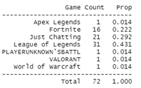 Figure 1: Count and Proportion of the Top Ranked Game
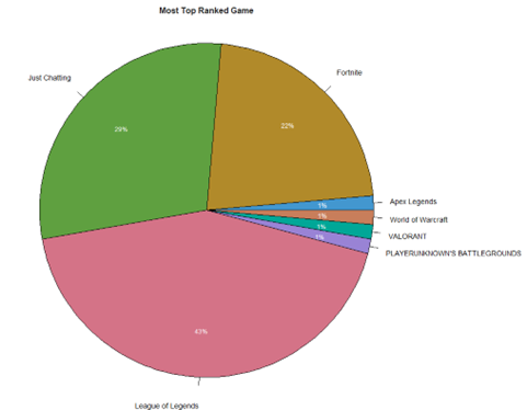 Figure 2: Pie Chart of Most Top Ranked Game
Figure 1 gives us the numerical count and proportion of all the games ranked at number 1 while Figure 2 translates this information into a pie chart. From both Figure 1 and Figure 2, we can understand that “League of Legends” holds the top spot as the most top ranked game at 43% with a margin of 14% from second placed “Just Chatting” at 29%.
- Secondly, what is the top ranked game of each year?
- This means the game that is ranked top for each year from 2016 to 2021. The code from R and outputs are shown below.
1
2
3
4
5
6
7
8
9
10
11
12
13
14
15
16
17
18
19
20
21
22
23
24
25
26
27
28
29
30
31
32
33
34
35
36
#Select and save all data that were ranked Number 1 for each
#year in a new variable
rank_2016 <- subset(twitch_data, Rank == 1 & Year == 2016)
rank_2017 <- subset(twitch_data, Rank == 1 & Year == 2017)
rank_2018 <- subset(twitch_data, Rank == 1 & Year == 2018)
rank_2019 <- subset(twitch_data, Rank == 1 & Year == 2019)
rank_2020 <- subset(twitch_data, Rank == 1 & Year == 2020)
rank_2021 <- subset(twitch_data, Rank == 1 & Year == 2021)

#Compute percentages for top ranked game by year and save in a vector
Percentage <- c(round(max(table(rank_2016$Game)/length(rank_2016$Game))*100, digits = 2),
                round(max(table(rank_2017$Game)/length(rank_2017$Game))*100, digits = 2),
                round(max(table(rank_2018$Game)/length(rank_2018$Game))*100, digits = 2),
                round(max(table(rank_2019$Game)/length(rank_2019$Game))*100, digits = 2),
                round(max(table(rank_2020$Game)/length(rank_2020$Game))*100, digits = 2),
                round(max(table(rank_2021$Game)/length(rank_2021$Game))*100, digits = 2))

#Get the name of top ranked game by year and save in a vector
Game <- c(max(rank_2016$Game), max(rank_2017$Game), max(rank_2018$Game), max(rank_2019$Game),
          max(rank_2020$Game), max(rank_2021$Game))

#Save the years into a vector
Year <- c(2016, 2017, 2018, 2019, 2020, 2021)

#Code block to derive the bar chart of top ranked game by year using plotly package
data <- data.frame(Game, Percentage, Year)

fig <- plot_ly(data, x = ~Year, y = ~Percentage, type = 'bar',
               text = Game, textposition = 'auto',
               marker = list(color = 'rgb(158,202,225)',
                line = list(color = 'rgb(8,48,107)', width = 1.5)))

fig <- fig %>% layout(title = "Top Ranked Game of Each Year",
                      xaxis = list(title = "Year"),
                      yaxis = list(title = "Percentage(%)"))
fig
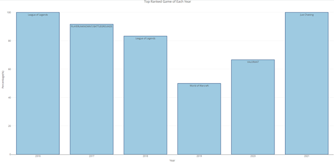 Figure 3: Bar Chart of Top Ranked Game by Year
From Figure 3, it is clear that every year sees a different game being ranked top except for “League of Legends” which was top ranked in both 2016 and 2018. “World of Warcraft” was the top ranked game with the lowest percentage in its respective year with 50%. The latest game to be crowned top and also dominating its ranking throughout the year is “Just Chatting” with a complete score of 100%.
Descriptive Statistics
Descriptive statistics on numerical data can be done referring to numerical computation of the data frame and this includes the central tendency, shape, outliers and visualization. These analyses can be presented in a single section called summary from R Studio.
Firstly, histogram is plotted to show how different variables will change relating with other variables. The variables that have been used are the month and average viewers ratio. To do so grouping of average viewers ratio by month is done. Besides, this histogram consists of relative frequency of average viewer ratio. The relative frequency is calculated where each value in a cell is divided by the total sum of the average viewer ratio. The total of relative frequency is always 1 it is distributed among the months. Below shown is the R script and also the plot obtained and it can be seen that January has the highest frequency compared to all other months with value 0.2. The sample size for this observation is 72 rows after grouped and filtered. From the histogram we are able to see blank space where it shows no value between frequency of 0.15 to 0.2.
1
2
3
4
5
6
7
8
9
10
11
12
13
14
15
16
17
18
19
20
21
22
23
24
25
26
27
28
#Numerical Analysis
install.packages("ggplot2")
install.packages("tidyr")
install.packages("reshape2")
install.packages("dplyr")

#Histogram
#Firstly grouping of twitch average viewer ratio by month in a data frame
group <- aggregate(x=twitch$Avg_viewer_ratio, by=list(twitch$Month), FUN=sum)
group

#Calculation of relative frequency
frequency <- group$x/sum(group$x)
frequency

#Plotting of histogram
x <- c("January", "February", "March", "April", "May", "June", "July", "August",
        "September", "October", "November", "December")

y <- c(frequency)

relative_frequency <- data.frame(x,y)
relative_frequency
names(relative_frequency) <- c("Month", "Relative Frequency")
ggplot(data=relative_frequency, aes(x=Month, y=frequency, fill=Month))+
    geom_bar(stat="identity", width=0.5)+theme_minimal()+
    scale_x_discrete(limits=month.name, guide=guide_axis(n.dodge=2))+
    ggtitle("Histogram of Relative Frequency of Average Viewers Ratio by Month")
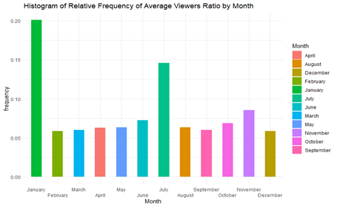 Figure 4: Histogram Chart
Box plot is essential when studying the central tendency of a variable. The visualization is related to a game named “League of Legend”. The variables that are included in this analysis are Year, Month and Average viewer ratio. First, the filtering of data is done based on the required observation and then creation of a new dataframe with data that includes all months, years and average viewer ratio values for League of Legends. Below shown is the plot done in R where the median value of the average viewer ration of League of Legend is 50.73. There are no outliers spotted in this observation.
1
2
3
4
5
6
7
8
9
10
11
12
13
14
15
16
17
#Box Plot

#Filtering Data
LOL <- twitch %>% filter(Game=="League of Legends")
LOL

#Creating New Data Frame
data.frame(LOL$Year, LOL$Month, LOL$Avg_viewer_ratio)

#Plotting of box plot
h <- ggplot(data=LOL, aes(x=Year, y=Avg_viewer_ratio, group=1))+geom_boxplot()      +ggtitle("Boxplot of Average Viewer Ratio by Year")+coord_flip()
h

#Central Tendency
median(LOL$Avg_viewer_ratio)
mean(LOL$Avg_viewer_ratio)
summary(LOL)
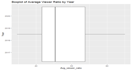 Figure 5: Box Plot of League of Legends
As for dot plot the variable used here is the analysis of peak channels of a game named Valorant in the year 2021 grouped by months. In order to plot a dot chart filtering and grouping is done earlier where a specific game is selected. Next, the month in the data frame is in integers. To change the numbering to names of the month renaming is done and proceed with plotting. Below shown is the script and also the dot chart for the above observation. From the chart we are able to see that the highest peak channel is obtained in April 2021. The sample size obtained from the grouping of the observation is 12 samples where 1 each for every month in 2021. To avoid any messy interpretation of the observation the year is filtered to 2021.
1
2
3
4
5
6
7
8
9
10
11
12
#Dot Plot
#Filtering data with selective game and year grouped by year
new_data <- twitch %>% filter(Year=='2021', Game=='VALORANT') %>% group_by(Month)

#Renaming value in month column with name of the months
new_data$Month <- factor(month, name, levels=month.name)

#Plotting of dot chart
dotchart(new_data$Peak_channels, labels=new_data$Month, pch=21, bg="green",
        pt.cek=1.5,
        title("Dotplot of valorant Game with Channel Count in 2021"),
        xlab="Peak Channels")
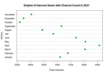 Figure 6: Dot Plot of Valorant
Inference Statistics
Statistical Hypothesis
The statistical hypothesis is a claim about the value of a parameter or population characteristics. The problem that we want to solve is as below and the operation can be carried out in R with the following lines of code.
- Problem Statement:
- Supposed that Twitch claims that the mean hours watched of games is more than 4,500,000 hours. A random sample of 15 top games is selected. At α=0.05, is there enough evidence to support the claim from Twitch? From the problem statement, we found that it is a right-tailed test as the null hypothesis is,
- 𝐻𝑜∶ 𝜇=4,500,000, 𝐻1∶ 𝜇>4,500,000 (𝑐𝑙𝑎𝑖𝑚𝑒𝑑)
1
2
sample_15 <- sample(twitch_data$Hours_watched, 15, replace = FALSE, prob = NULL)
t.test(sample_15, mu=4500000, alternative = "greater")
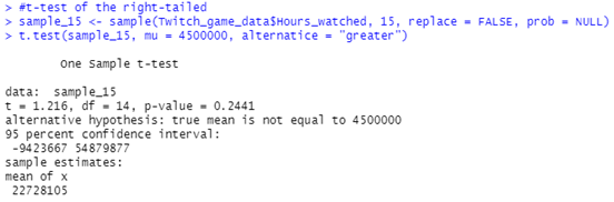 Figure 7: Output of The Code That Shows the Values of t-test Right-Tailed
Since the p-value of the t-test is 0.5383 which is more than the α, 0.05 and it is not in the critical region, the decision is not to reject the null hypothesis. Hence, there is not enough evidence to support the claim that the mean hours watched of the games is more than 4,500,000.
ANOVA
ANOVA is a method of testing the equality of three or more population means by analyzing sample variance. The problem that we want to solve is as below and the operation can be carried out in R with the following lines of code.
- Problem Statement:
- Check to see if there is a difference in the peak viewers for three different years, 2019, 2020, 2021. At alpha = 0.05, test the claim that there is no difference among the means. From the problem statement, we found that the hypothesis is as below.
- 𝐻𝑜∶ 𝜇2019=𝜇2020=𝜇2021, 𝐻1∶ 𝐴𝑡 𝑙𝑒𝑎𝑠𝑡 𝑜𝑛𝑒 𝑚𝑒𝑎𝑛 𝑖𝑠 𝑑𝑖𝑓𝑓𝑒𝑟𝑒𝑛𝑡 𝑓𝑟𝑜𝑚 𝑡ℎ𝑒 𝑜𝑡ℎ𝑒𝑟𝑠
1
2
3
anova_data <- subset(twitch_data, Year == 2019 | Year == 2020 | Year == 2021)
anova_model <- aov(anova_data$Peak_viewers ~ factor(anova_data$Year), data = anova_data)
summary(anova_model)
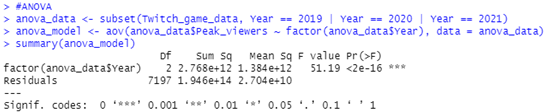 Figure 8: Output of The Code That Shows the p-value of ANOVA
Based on the output, the p-value is less than the significance level 0.05. Hence, we can conclude that there are significant differences between the three different years.
The dataset and the .R script mentioned in this article are hosted in my Github Repo