
Background
According to (Usmani et al., 2020), Malaysia is a developing country with a focus on industrialization and this has led the quality of air from healthy to worse by means of releasing many harmful particles into the atmosphere. In an effort to address this issue, the Malaysia DOE in 1989 formulated air quality guidelines which progressed in 1993 by introducing an air quality measuring index system which is called the Malaysian Air Quality Index (MAQI). Moving forward in 1996, factoring in regional and global harmonization, a new system known as air pollution index (API) was adopted. This is the similar API that was mentioned in previous sections. API in itself follows the pollution standard index (PSI), which is used by United States Environmental Protection Agency (USEPA) (APIMS, n.d.).
The driving force behind climate change is air pollution, and it is widely considered to be one of the biggest environmental challenges faced by humanity in the twenty-first century (Matson, 2001). The air pollution has severe and harmful effect on health, and it has become a serious global threat to human health and welfare (Kampa, 2008). Worryingly, according to (WHO, 2016), ninety-two percent of the world’s population breathes dirty air, and which accounts for 6.5 million deaths worldwide (11.6% of all global deaths). Numerous cardiovascular and respiratory diseases caused by air pollution contribute significantly to loss of life with cardiovascular diseases (CVD) being the leading cause of deaths worldwide and as estimated, 17.9 million die due to CVD each year, which amounts to 31% of all deaths (Usmani, 2020). The “pyramid of effects” as illustrated in Figure 1, shows how pollutants are related to incidence and severity. Bottom of the pyramid depicts that asthma attacks and cardiac effects are less severe and affect a larger population while towards the tip of the pyramid, heart attacks and hospital admissions are more severe and affect a smaller proportion of the population (Usmani, 2020).
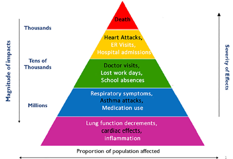 Figure 1: “Pyramid of Effects”. Adapted from (Usmani, 2020)
But where exactly does air pollution come from? The term air pollution in itself is a result of a complex mixture containing thousands of pollutants (Seinfeld & Pandis, 2016). The mixture mentioned contains suspended liquid and solid particles, majorly comprising of particulate matter (PM), and several gases such as volatile organic compounds (VOCs), ozone (𝑂3), carbon monoxide (CO) and nitrogen oxides (𝑁𝑂2). This constitution of toxic particles and gases differs according to the sources of emissions and geographical locations. Adding to that, the shape, size, number, chemical composition, surface area, toxicity and solubility are also variable and dependent on these factors. Many processes cause air pollution, such as fossil fuel combustion in automotives (airplanes, trucks, cars and other engines) and power plants, industries and household heating systems. This emission of chemicals and toxic gases react with the sunlight in ways that multiply the toxicity of the substance (Usmani, 2020). The summary of the sources of pollutant is illustrated in Figure 2.
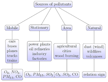 Figure 2: Sources of Pollutants. Adapted from (Usmani, 2020)
Until recently, the air quality monitoring activities in Malaysia was carried out through a private company known as Alam Sekitar Malaysia Sdn Bhd (ASMA) until year 2017. ASMA was appointed by the DOE and the Malaysian Meteorological Department (METMalaysia), and it was responsible for collecting, processing, analysing and distributing air pollutant measurements. There are 66 air quality monitoring stations across Malaysia, 14 manual sampling (high volume sampler) stations were operated by METMalaysia, and ASMA operated 52 continuous air-quality monitoring (CAQM) stations. The DOE has increased the overall number of CAQM stations to 68 (APIMS, n.d.). The geographical location of the CAQM stations is depicted in Figure 3.
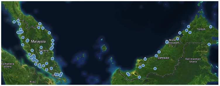 Figure 3: CAQM Stations in Malaysia. Adapted from (Usmani, 2020)
DOE has played a major role in keeping a record of the air and taking necessary measures to create awareness among people about keeping the air clean. Along with DOE, the Ministry of Health (MOH) has played a vital role in raising awareness for air pollution and harms associated with it. MOH has mentioned on their website the measure required for haze days as well as the long-term exposure health risks associated with the pollutants. Long-term exposure to haze is known to cause abortions, birth defects and infant death. This particulate matter thickens the arteries and causes heart diseases. However, it must be clearly noted that the terrors haze brings are not only limited to these diseases. DOE established the Clean Air Action Plan (CAAP) (2010–2020) in 2011. In the effort to improve the quality of air, the CAAP targeted five strategies, namely (Usmani, 2020):
- Motor vehicle emission control
- Control forest and land fires to prevent haze pollution
- Reduce emissions from industries
- Build institutional capabilities and capacity
- Strengthen participation and awareness of public
Description of Dataset
The dataset used in this project is a CSV file of “Air Pollution Index (API) of Cities in Malaysia” and the source for this dataset was from Kaggle, a huge online community of data scientists and machine learning practitioners. More specifically, this dataset was contributed by (Shung, 2022) and is licensed under Creative Commons Attribution and Open Definition 2.1. By default, the shape of the dataset upon downloading is 71460 rows (including headers) and 66 columns. Data was recorded from the years of 2005 till 2022, resulting in a total of 18 years’ worth of API data in Malaysia. (Shung, 2022) aggregated the data from 2005 to 2007 by web scraping from (Portal Data Terbuka Malaysia, n.d.) under the filter of Ministry of Science, Technology and Innovation (MOSTI), Department of Environment (DOE) and Kementerian Tenaga dan Sumber Asli (KeTSA). The remaining data from 2018 to 2022 on the other hand was retrieved directly by (Shung, 2022) from (APIMS, n.d.). According to (APIMS, n.d.), the value of API in itself is derived by the steps below,
- The average calculation for each parameter is taken at different range of periods by taking into account that they have different exposure periods that are acceptable to humans. The parameters and its respective averaging period are given as in Table 1.
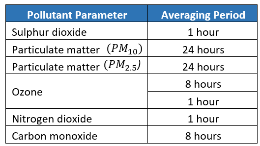 Table 1: API Averaging Period. Adapted from (APIMS, n.d.)
The average concentration of each pollutant over a given period is then standardized using a specific mathematical formula to produce a non-unitary value called sub-index.
Each pollutant will produce its sub-index and the highest relative sub-index will be considered as the API reading.
Generally speaking, API readings are determined by the concentration of particulate matter that is the dominant pollutant for the majority of the time. The scale to judge API on its impact towards health is given in Table 2.
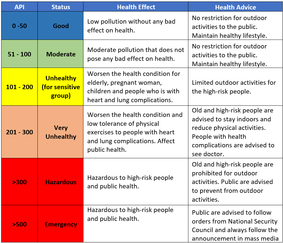 Table 2: API Impact on Health. Adapted from (APIMS, n.d.)
The summary of the entire dataset information, statistical summary and snippet of the dataset is given in Table 3, Figure 4 and Figure 5 respectively.
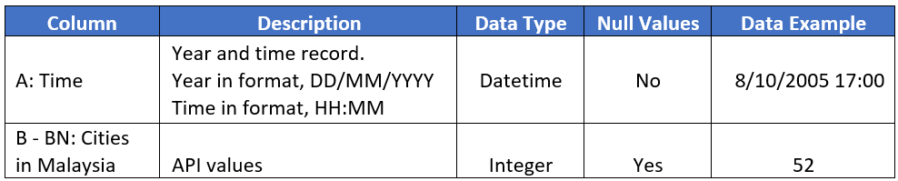 Table 3: Summary of Entire Dataset
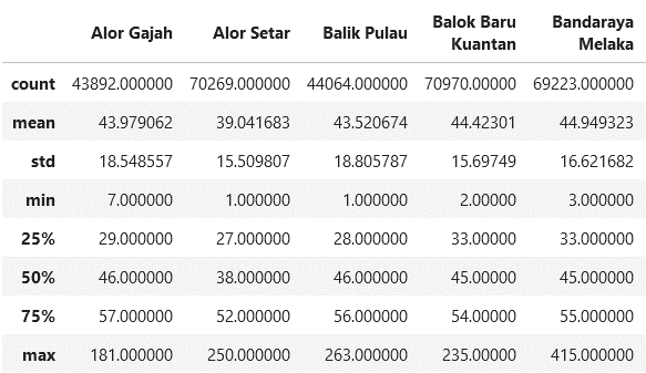 Figure 4: Statistical Summary of Dataset
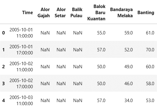 Figure 5: Snippet of Dataset
The dataset and the Jupyter Notebook to Pre-process the data mentioned in this article are hosted in my Github Repo
Objective
The objective of this study is to highlight the severity of air pollution in cities across Malaysia. Data concerning this issue will be transparent and of relevant governmental origin to ensure studies are verifiable and repeatable with future data. The severity of air pollution will be studied using the relationship of API values against time, which shall result in an observable trend. Subsequently, the outcome from this study by the means of raising awareness, will act as a call to action in reducing overall air pollution in Malaysia by the general public.
Big Idea
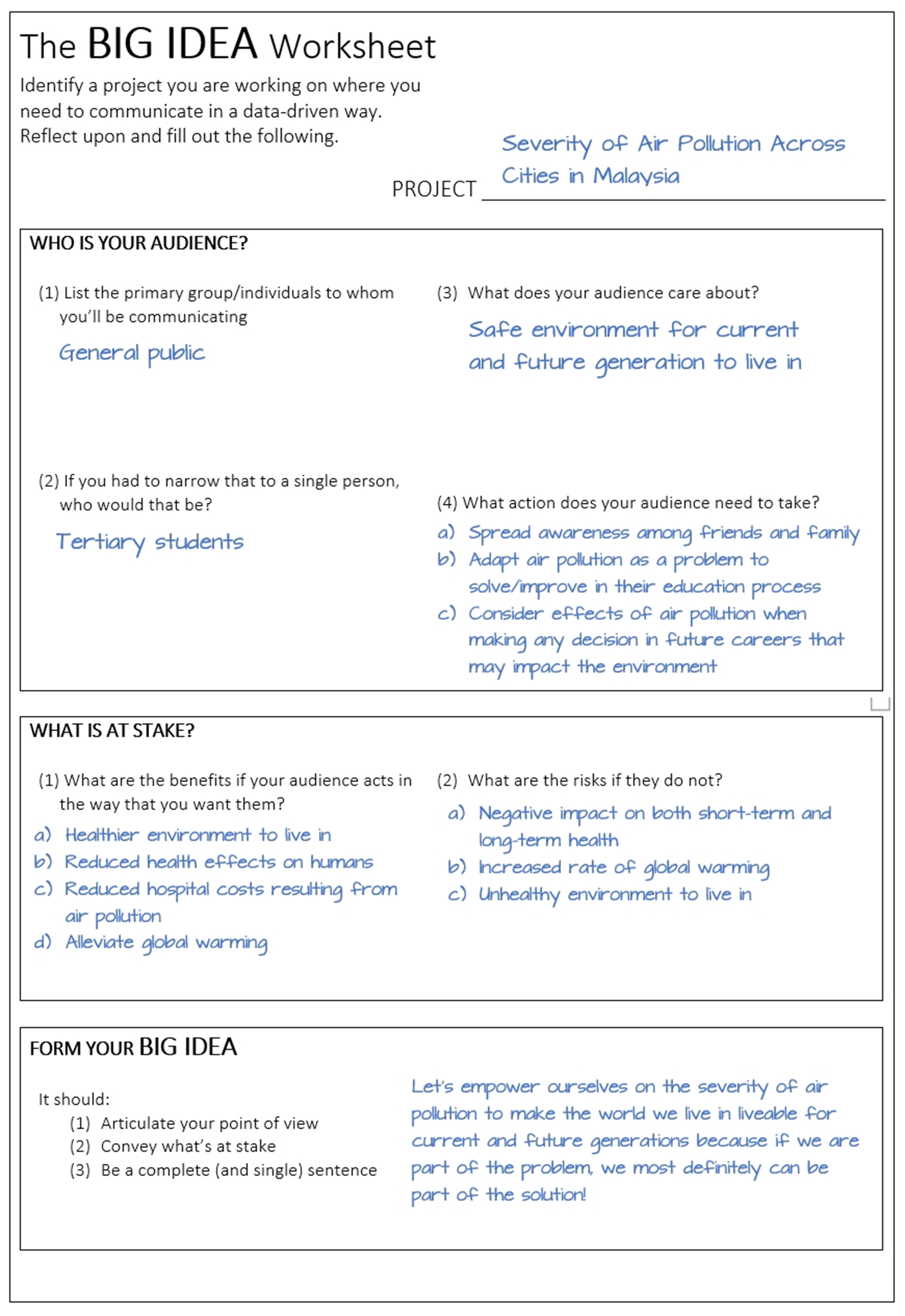 Figure 6: Big Idea of Project
Storyboard
Problem:
(a) Issue: Severity of air pollution across cities in Malaysia
(b) Current Implementation: Clean Air Action Plan (CAAP)
(c) Impact: Large portion of public are nonchalant about air pollution and its effects while unaware of CAAP initiative and what activities it entails.
Action/Analysis:
(a) Action taken: Collect and aggregate 18 years’ worth of air pollution data for cities across Malaysia.
(b) Objective: Identify the severity of air pollution in Malaysia
(c) Exploratory Data Analysis:
- Average API for all cities across Malaysia in 2005 was 28.49
- Average API for all cities across Malaysia in 2022 was 44.11
- Average API for all cities across Malaysia in 2000’s was 31.95, 2010’s was 33.49, and 2020’s was 43.9
- Average API for cities in East Malaysia was 30.1 while cities in West Malaysia was 36.15
- Average API for cities across Malaysia during the events of Covid-19 (2020 – 2022) was 43.9, while the API readings from three years prior (2017 – 2019) was 35.43
(d) Recommended solution: Use public transportation, choose recycling garbage rather than open burning, cleaner industrial processes and switching over to renewable energy sources.
Outcome
(a) Call to action: If we are part of the problem, we most definitely can be part of the solution!
(b) What do you need to do? Understand the severity of air pollution and spread the awareness to friends and family, adapt air pollution as a problem to solve/improve in education process (Harness the potential and power of data science, machine learning and artificial intelligence), and importantly, if you are in a position of power in your career, consider the effects of air pollution when making a decision.
3-Minute Story
Air pollution has become one of those things in life where we know it is bad and that is just it. We know it is bad and our attitude is almost “It’s not our problem” or the classic line of “It’s beyond our hands”. But how bad is really bad? The severity of air pollution across cities in Malaysia is something serious that the general population needs to be aware of. Among the efforts to alleviate this problem is the Clean Action Air Plan (CAAP), but having said that, it remains to be seen if people actually know of its existence or whether it is just a policy on paper to satisfy higher-ups. It cannot be stressed enough that last minute enthusiasm does not and will not compensate for a lack of ongoing effort. To really understand the gravity of this issue, 18 years’ worth of air pollution data in the form of Air Pollution Index (API) readings from cities across Malaysia was collected, aggregated and analysed. There is a saying, torture numbers, and they will confess to anything. Putting that quote to action, it was revealed that the average API reading in 2005 (Beginning year of the dataset) was 28.49 while in 2022 (End year of the dataset), the average API reading spiked up to 44.11. A massive difference of 15.62 in 18 years. Not worrying enough? Let’s dive deeper. Looking at the data from decades perspective, average API in the 2000’s was 31.95, in the 2010’s it was 33.49 and in 2020’s, the one that we are currently living in, is 43.9. In case anyone had not noticed, the jump in average API from 2000’s to 2010’s is 1.54 while from 2010’s to 2020’s is a staggering 10.41. To put in percentages wise, that is a 576% spike. I would understand if you are shocked. Just imagine if a similar trend carries on to the next decade, will everyone be legally required to wear face masks outdoors then? Every living human being knows the trouble and suffering caused by Covid-19 and the countless movement control orders that citizens nationwide had to obey in curbing the spread of the virus. With all that less movement, less transportation activities and less industrial activities, it should reflect on the API readings, right? Right? I am sorry to say the answer is a hard no. In fact, from the data, average API for cities across Malaysia during the events of Covid-19 (2020 – 2022) was 43.9, while the API readings from three years prior (2017 – 2019) was 35.43. A 23.9% increase in air pollution from supposedly controlled movement. Is it all doomed then, you may ask. The road to salvation is not an easy one, but nonetheless there is hope. The solution to this problem is pretty much straight forward as it sounds. The usage of public transportation, choosing recycling garbage rather than open burning, adapting cleaner industrial processes and switching over to renewable energy sources on a massive scale will definitely turn the tide in our favour. The general population has to understand the severity of air pollution and spread the awareness among friends and family, and if you are a tertiary student, adapt air pollution as a problem to solve/improve in education process (Harness the potential and power of data science, machine learning and artificial intelligence), and importantly, if you are in a position of power in your career, consider the effects of air pollution when making a decision. With all that in mind, let us empower ourselves on the severity of air pollution to make the world we live in liveable for current and future generations because if we are part of the problem, we most definitely can be part of the solution!
Visualizations
The 5 primary visualizations that appear in the data storytelling video are illustrated in Figure 7, Figure 8, Figure 9, Figure 10 and Figure 11 respectively. They generally are of bar chart nature with lines to highlight the underlying trend. The following chapters on visual cues and visualizing with clarity shall delve into the creation of the visualizations and the intended information to be shared.
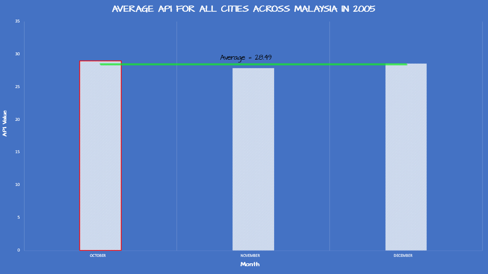 Figure 7: Average API for All Cities Across Malaysia in 2005
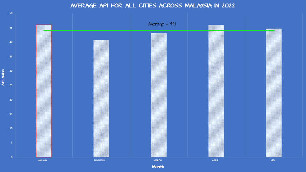 Figure 8: Average API for All Cities Across Malaysia in 2022
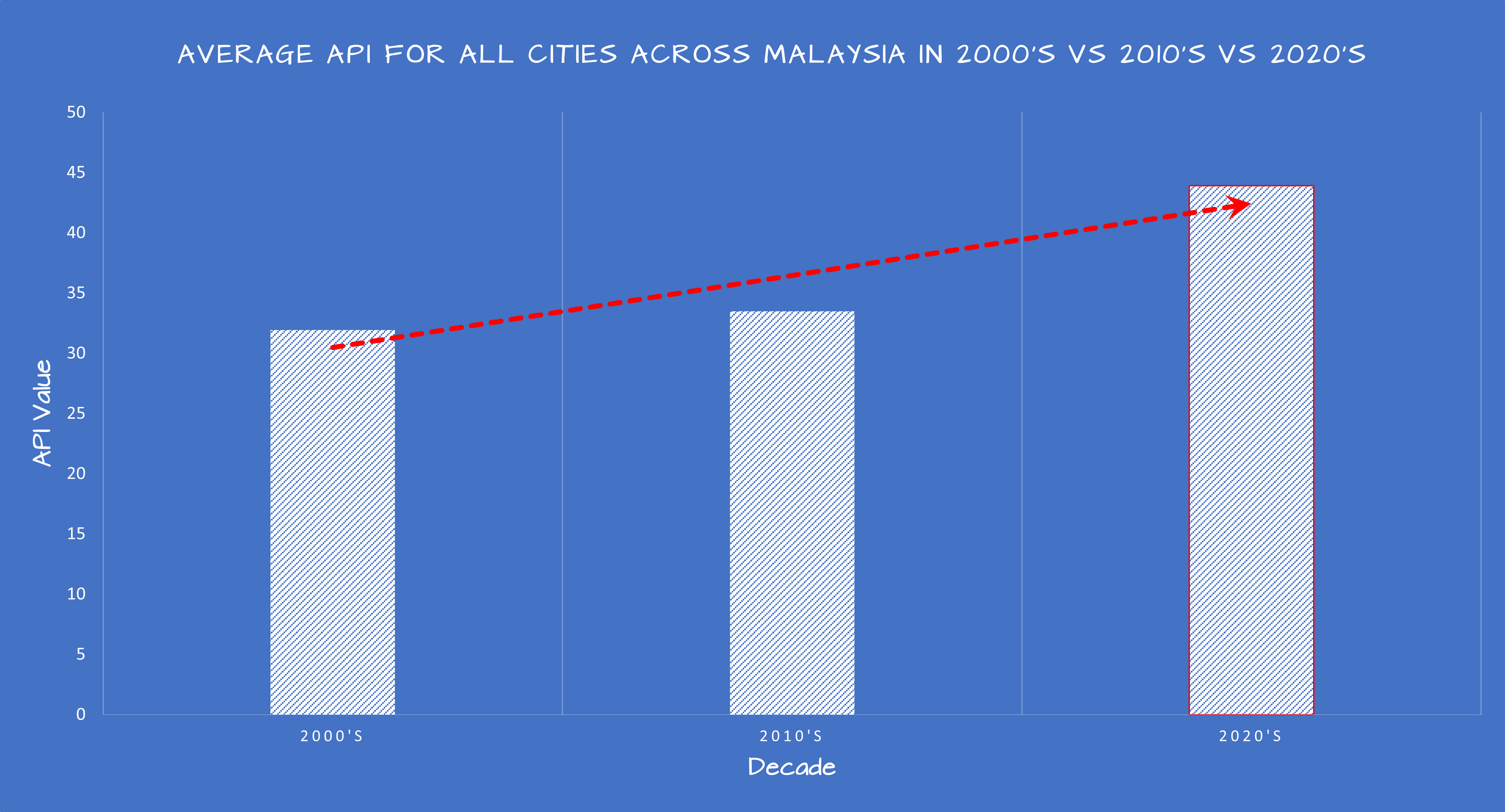 Figure 9: Average API for All Cities Across Malaysia in 2000’s vs 2010’s vs 2020’s
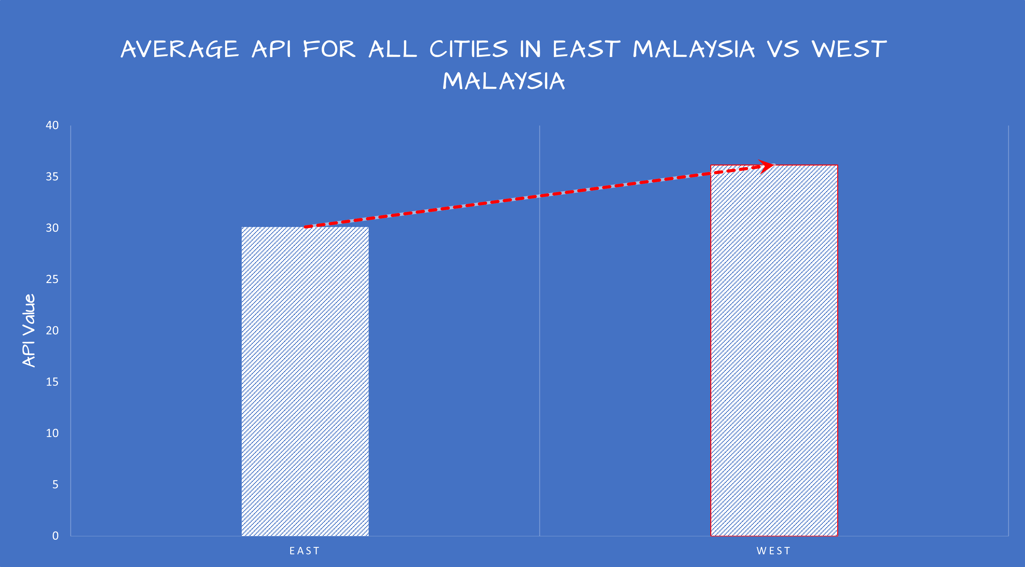 Figure 10: Average API for All Cities in East Malaysia vs West Malaysia
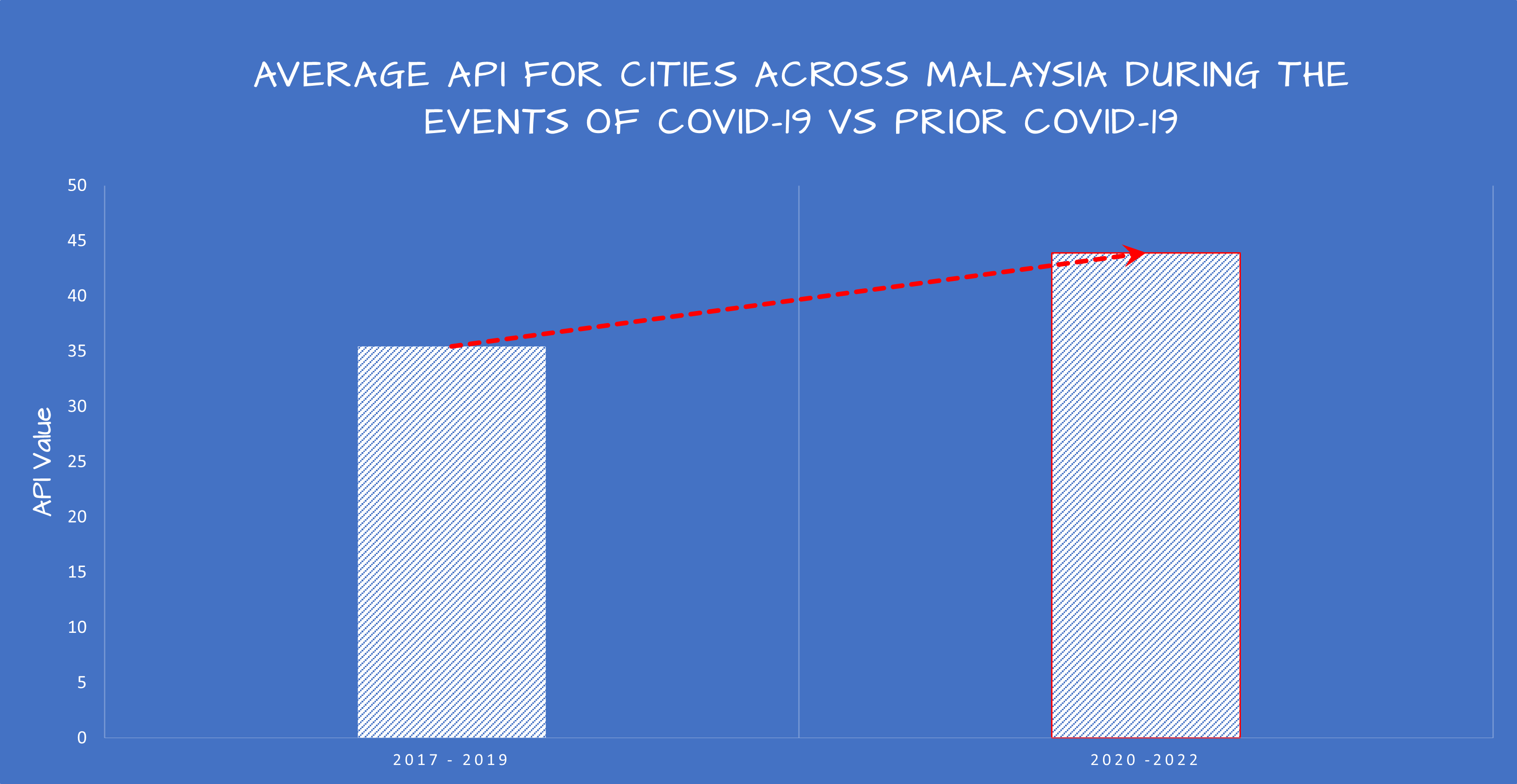 Figure 11: Average API for Cities Across Malaysia During the Events of COVID-19 vs Prior COVID-19
Visual Cues
In a seminal paper published in 1984 in the Journal of the American Statistical Association, Cleveland and McGill presented a ranking of visual cues or elements according to how easily and accurately people read them which is illustrated in Figure 12.
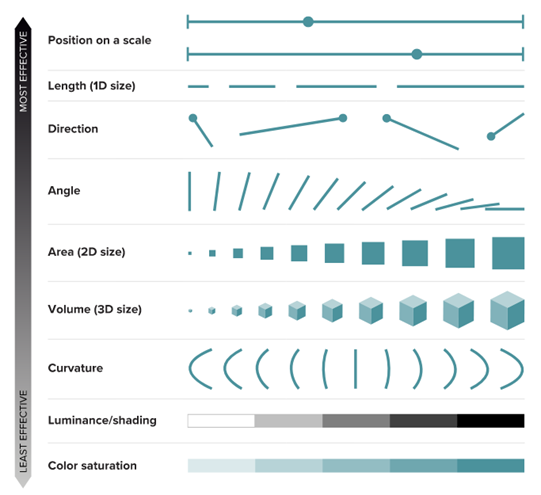 Figure 12: Ranking of Visual Cues. Adapted from (Mason, 2019)
Equipping Figure 12 ranking as a guide, the 5 primary visualizations that appear in the data storytelling video were constructed using,
Length
Standing at number 2 in the ranking of Figure 12, length has the ability to take advantage on a single concept that is understood universally. The longer, the greater. Line graphs work best with a huge number of data points in time-series data to show all the movement within the timeframe, and since the data aggregated here is limited to only data points of month within a year, years, decades and east versus west, the traditional bar chart is preferred for Figure 7, Figure 8, Figure 9, Figure 10 and Figure 11. According to (Nussbaumer, 2015), bar charts are sometimes avoided because they are common and this is a mistake as bar charts should be leveraged because they are common, which consequently means less of a learning curve for the audience. Instead of using their brain power to try to understand how to read the graph, the audience spends it figuring out what information to take away from the visual which is precisely the intention here. Displaying a visualization in a presentation and displaying a visualization in a data storytelling video are two different things. The main difference being time. Typically, in a presentation, a particular slide with a visualization will be paused and its respective information will be presented, while in a storytelling video, its method of execution is slightly different. To keep the audiences engaged, it is best not to linger on the same visualization beyond a few seconds to prevent the audience from losing interest. This means with the few moments that we have on a particular visualization, bar charts fit the bill to maximize information being shared and aside from being common, they are easy for our eyes to read. Our eyes compare the end points of the bars, so it is easy to see quickly which category is the biggest, which is the smallest, and also the incremental difference between categories.
Direction
Directional visual cues in the form of arrows whether it’s moving or stationary, are one of the most commonly used explicit visual cues because they are simple and easily understood. This can be particularly leveraged to help draw our audience eyes in the direction we want them to focus. In the case of Figure 9, Figure 10 and Figure 11, direction in the form of arrows were used to point out the difference in length between the bars (API values) and also to highlight the increasing trend of the API values.
Position and Colour Saturation
At a moment in the data storytelling video, specifically at runtime 2 minutes 53 seconds, a comparison of API values in east versus west was attempted by displaying a combination of position and colour saturation visual via a geographical heatmap (Figure 13) in the form of average API for cities in Malaysia.
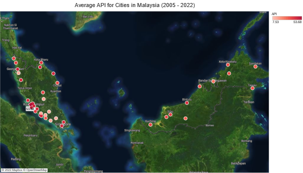 Figure 13: Average API for Cities in Malaysia (2005 - 2022)
Emphasizing the point made earlier, visualizations that appear in data storytelling videos need to be in the form that the audience can understand in a few seconds. Figure 13 has too many information to be understood in a relatively small timeframe. Visualizations such as Figure 13 works best in a dashboard platform where the intention is to display information at any given time, which is why the choice to include Figure 13 in the data storytelling video is purely intentional to add dramatic effect in transitioning to Figure 10.
Visualizing with Clarity
Visual hierarchy is the principle of arranging elements to show their order of importance. Designers structure visual characteristics so users are able to understand information easily. By laying out elements logically and strategically, designers have the ability to influence user perceptions and guide them to desired actions. Among the characteristics of visual hierarchy that has been used and manipulated in the data storytelling video are,
Grids
Grids have been used in Figure 7, Figure 8, Figure 9, Figure 10 and Figure 11 to emphasize the difference in each individual bars. Grids have been chosen for this purpose because they improve readability by dictating spacing and reflecting scale.
Alignment
Alignment in this context is aligning all visualizations in Figure 7, Figure 8, Figure 9, Figure 10 and Figure 11 to begin with a zero baseline. This is to avoid amplifying any patterns that are not significant. Echoing this sentiment is (Nussbaumer, 2015) who posited that because of how our eyes compare the relative end points of the bars, it is imperative that bar charts always have a zero baseline (where the x‐axis crosses the y‐axis at zero), otherwise the result is a false visual comparison.
Highlighting
Highlighting can guide audience through the data and direct eyeballs to the most important parts in a graphic. A red border is applied to the maximum bar in all five figures to attract more attention on the maximum value compared to the muted colours. Colour is used as the visual cue here to avoid any conflicting visual cues with the existing visualizations.
Annotation
Annotation within a visualization can help clearly explain what a visualization shows and this is particularly helpful with the cases of Figure 7 and Figure 8. While both the visualizations display the distribution of API values throughout its individual year, an annotation of the average value on the visualization clearly informs the audience on the primary message of the visualization. The annotations here are combined with a colour visual cue of green to denote the annotation’s position on the visualization.
Typography
Although there exists a norm for typography in professional work, the same cannot be said for creative fields. For data storytelling which involves plenty of creative choices, the choice of typography does play a major role in conveying information to an audience. The font (Subset of typography) chosen for visualizations in Figure 7, Figure 8, Figure 9, Figure 10 and Figure 11 is a font called ‘Architects Daughter’.This particular font is chosen because of its sketchy aesthetics that plays along well with the theme of the data storytelling video which is a whiteboard animation that involves writing and sketching.
Repetition
Repetition here is in the sense that when a particular style or visualization is constantly repeated, it can suggest to the audience that repeated contents are related to each other. This is applied on all Figure 7, Figure 8, Figure 9, Figure 10 and Figure 11. They share the same visualization type and same design aesthetics. When all this repetition is played out in the video, audiences will get the suggestion that all those 5 visualizations carry a related message throughout.
Data Storytelling Video
The video was animated using VideoScribe
Closing Thoughts
Data storytelling in its essence is the ability to effectively communicate insights from a dataset using narratives and visualizations. For an issue as serious as air pollution, data storytelling has the power to provide a compelling narrative in the severity of air pollution in cities across Malaysia. From the data collected and through the manipulation and combined use of visual cues such as length, direction, position and colour together with visual hierarchy elements like grids, alignment, highlighting, annotation, typography and repetition, the data storytelling video for this project can provide an important message on the rising air pollution in Malaysia to people from all walks of life.
References
Abdullah, S., Mansor, A. A., Napi, N., Mansor, W., Ahmed, A. N., Ismail, M., & Ramly, Z. (2020). Air quality status during 2020 Malaysia Movement Control Order (MCO) due to 2019 novel coronavirus (2019-nCoV) pandemic. The Science of the total environment, 729, 139022. https://doi.org/10.1016/j.scitotenv.2020.139022
APIMS. (n.d.). Air Program Information Management System. http://apims.doe.gov.my/
Kampa, M., & Castanas, E. (2008). Human health effects of air pollution. Environmental Pollution, 151(2), 362–367. https://doi.org/10.1016/j.envpol.2007.06.012
Mason, B. (2019). Why scientists need to be better at data visualization. Knowable Magazine. https://doi.org/10.1146/KNOWABLE-110919-1
Matson, P. (2001). Environmental challenges for the twenty-first century: Interacting challenges and integrative solutions. Ecology Law Quarterly, 27(4), 1179–1190. https://www.jstor.org/stable/24114055
Nussbaumer, KC. (2015). Storytelling with data (C. N. Knaflic, Ed.). John Wiley & Sons.
Portal Data Terbuka Malaysia. (n.d.). Portal Data Terbuka Malaysia. https://www.data.gov.my/
Seinfeld, J.H., & Pandis, S.N. (2016). Atmospheric Chemistry and Physics: From Air Pollution to Climate Change. John Wiley & Sons, Hoboken.
Shafie, M., S. H., Mahmud, M., Mohamad, S., Rameli, N. L. F., Abdullah, R., & Mohamed, A. F. (2022). Influence of urban air pollution on the population in the Klang Valley, Malaysia: a spatial approach. Ecological Processes, 11(1). https://doi.org/10.1186/s13717-021-00342-0
Shung, NY. (2022, May 7). Air Pollution Index (API) in Malaysia. Kaggle. https://www.kaggle.com/datasets/ynshung/malaysia-air-pollution-index
Usmani, R. S. A., Saeed, A., Abdullahi, A. M., Pillai, T. R., Jhanjhi, N. Z., & Hashem, I. A. T. (2020). Air pollution and its health impacts in Malaysia: a review. Air Quality, Atmosphere and Health, 13(9), 1093–1118. https://doi.org/10.1007/s11869-020-00867-x
WHO. (2016). WHO releases country estimates on air pollution exposure and health impact. World Health Organization. https://www.who.int/news/item/27-09-2016-who-releases-country-estimates-on-air-pollution-exposure-and-health-impact