
The following article examines the essential steps and important details in creating the required dashboard. Microsoft Power BI is the main software used for this purpose.
Data Model
There are 4 main datasets that are imported to be used in developing the dashboard. Those datasets are as follows,
- Crime incident dataset: This dataset comprises of the latitude and longitude of crime incidents, crime types, police jurisdiction area, last outcome category, LSOA code and name, date, and reporting details.
- Crime rate dataset: This dataset includes the crime rates at LSOA level and together with population, population density, unemployment rate, inflation rate, and all the deprivation scores.
- Geography lookup dataset: This dataset acts as a Local Area District (LAD) lookup table for both data mentioned above. The snippet of this dataset is shown in Figure 1 below.
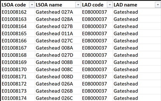 Figure 1: Snippet of LAD geography lookup dataset
- Glossary dataset: This dataset consists of a table that describes all the key terms mentioned in the dashboard and its respective description. The snippet of the dataset is as is in Figure 2 below.
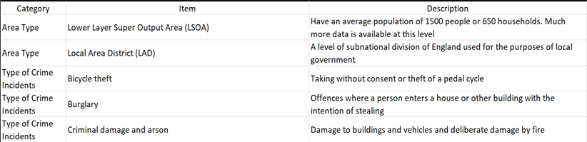 Figure 2: Snippet of Glossary Dataset
To enable the lookup capabilities in Geography Lookup Dataset, it has a one to many (1:*) relationship with both Crime Incident data and Crime Rate data with the joining key being lower layer super output area (LSOA) code. The entity relationship diagram (ERD) of all 4 datasets is illustrated in Figure 3 below.
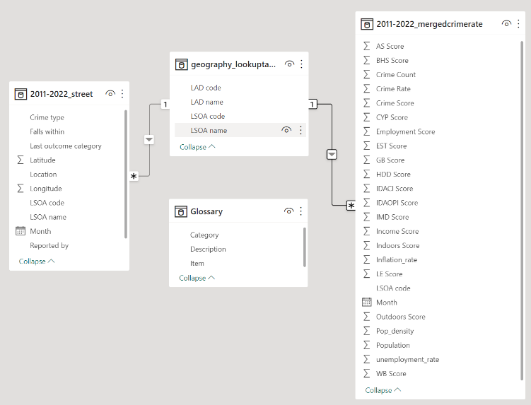 Figure 3: ERD of Datasets
Design Aesthetic
The term “design aesthetic” in this project refers to the visual style of the dashboard, including elements like colours, typography, layout, and imagery. An effective design aesthetic should be visually appealing and easy to understand, helping users quickly find important information. A clean design aesthetic makes it easier for users to navigate and comprehend the data. The use of colours, typography, and imagery helps highlight important information and draw attention to key metrics. Consistency in layout and design across the dashboard improves user-friendly information retrieval.
The design aesthetic chosen for this project aims to be familiar and comfortable for most users. It is inspired by modern applications designed for mobile devices like smartphones and iPads. This choice was made to make it easier for new users to get familiar with the dashboard. To maintain a consistent look, a light grey colour was used throughout all pages. This colour was selected for its ability to convey a serious, professional, and elegant feel, while also making the content easy to read and providing contrast with other colours. Another important design element in the dashboard is the use of colour gradients to show differences in magnitude between items. Slicers shall be utilized throughout the dashboard to enable interactivity with various data fields. In total, there are 6 pages in the dashboard which are homepage, crime incidents information, crime rates information, crime heatmap, ML predicted crime rates and glossary.
Home Page
When users initially access the dashboard, they are directed to the homepage by default. The homepage serves as an introductory page, as demonstrated in Figure 4 below. It includes a title, a short welcome message, and clickable buttons that allow users to navigate to other pages within the dashboard.
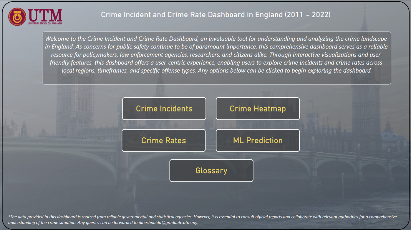 Figure 4: Homepage of Dashboard
Crime Incidents Information
The crime incidents information page, shown in Figure 5 below, aims to present a summarized and interactive view of the crime incidents data. This dashboard page focuses on addressing the following questions:
- What is the total crime incident counts?
- What is the most occurring crime type and its count?
- How does the crime incidents trend look like?
- What are the LSOAs with the highest crime incidents?
- What are the LSOAs with the lowest crime incidents?
- Where are the locations of crime clusters?
Visual cues are utilized in the charts to aid in understanding the information better. One such cue is the use of colour saturation of red and green to indicate variations in magnitude. This dashboard page also incorporates multiple slicers to enhance interactivity which means that users can select one or more slicers and instantly visualize the answers to the questions mentioned in 1. to 6. above. The slicer options included in this page are crime type, LAD name, police jurisdiction area, last outcome category, LSOA name and crime incident period.
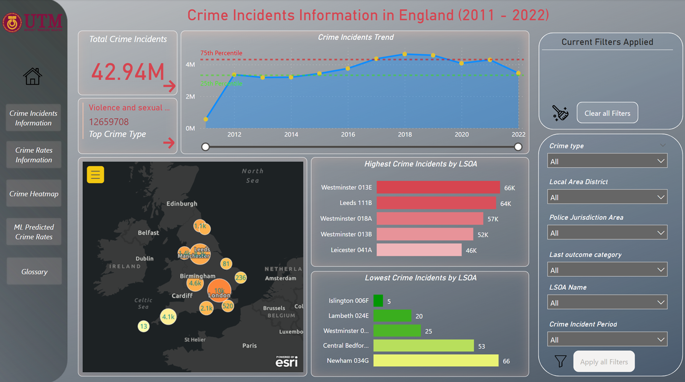 Figure 5: Crime Incidents Information page of Dashboard
Crime Rates Information
The crime rates information page, displayed in Figure 6 below, has a similar appearance to the crime incidents information page shown in Figure 5. However, there are key distinctions. In this case, the page presents crime rates instead of crime incidents counts, and instead of a point map with clustering, it features a choropleth map of LAD. The primary objective of this dashboard page is to address the following questions:
- What is the total crime incident counts?
- What is the most occurring crime type and its count?
- What is the range of crime rates?
- How does the crime rates trend look like?
- What are the LSOAs with the highest average crime rates?
- What are the LSOAs with the lowest average crime rates?
- What is the difference in crime rates between LAD?
The ability to interact with the questions above via a slicer is available with the options of either single or multiple selection of LAD, LSOA name and time period.
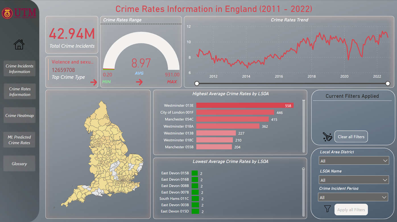 Figure 6: Crime Rates Information page of Dashboard
Crime Heatmap
In contrast to the preceding dashboard pages, the focus of this page, as depicted in Figure 7 below, is solely on presenting an overview of crime incidents through a heatmap, without the inclusion of additional charts or statistics. The slicer interactivity remains the same as depicted in Figure 5. The level of insight provided on this page is primarily descriptive and notably, the heatmap reinforces the observation that the City of London exhibits the highest number of crime incidents when compared to other locations in England.
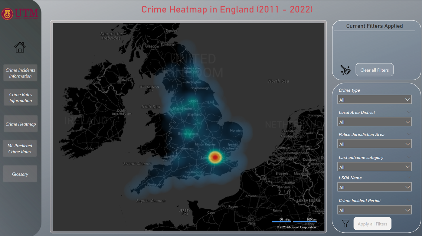 Figure 7: Crime Heatmap page of Dashboard
ML Predicted Crime Rates
The final Crime Rate ML models developed in this project will be utilized to predict crime rates and integrate the results into the dashboard. Although Microsoft Power BI has the capability to directly import and run Python scripts for prediction, it is not suitable for this project due to the large dataset size and the lengthy computation time it would require. Therefore, Jupyter notebook is employed to execute the prediction, store the results in a Pandas Dataframe, and merge the Dataframe with the crime rates dataset. This process is performed for both the Random Forest Regression and XGBoost Regression models.
The combined crime rate dataset is saved as a .csv file and imported into Microsoft Power BI, where a line chart is generated to present the actual and predicted crime rates for both the Random Forest Regression and XGBoost Regression models. Additionally, a statistical measure called the average bias of predicted crime rates compared to the actual crime rates is included alongside the charts. This measure is computed by taking the absolute difference between the predicted and actual crime rates and calculating the average. Users can utilize this average bias in conjunction with the line chart to visually assess the performance of the ML models. Like previous dashboard pages, slicers in the form of LAD, LSOA name, and crime incident period are available on this page. The level of insight on this page is primarily descriptive. A screenshot of the ML predicted crime rate dashboard page can be seen in Figure 8 below.
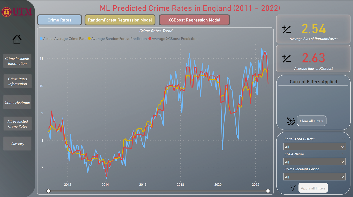 Figure 8: ML Predicted Crime Rates page of Dashboard
Glossary
The glossary page serves as a dictionary for the entire dashboard, providing users with explanations of the terms used throughout the dashboard. The glossary table is organized into four main categories which are area type, deprivation domain scores, type of crime incidents, and ML. Users can refer to this page to gain a better understanding of the terms mentioned within the dashboard. The screenshot of the glossary page is shown below in Figure 9.
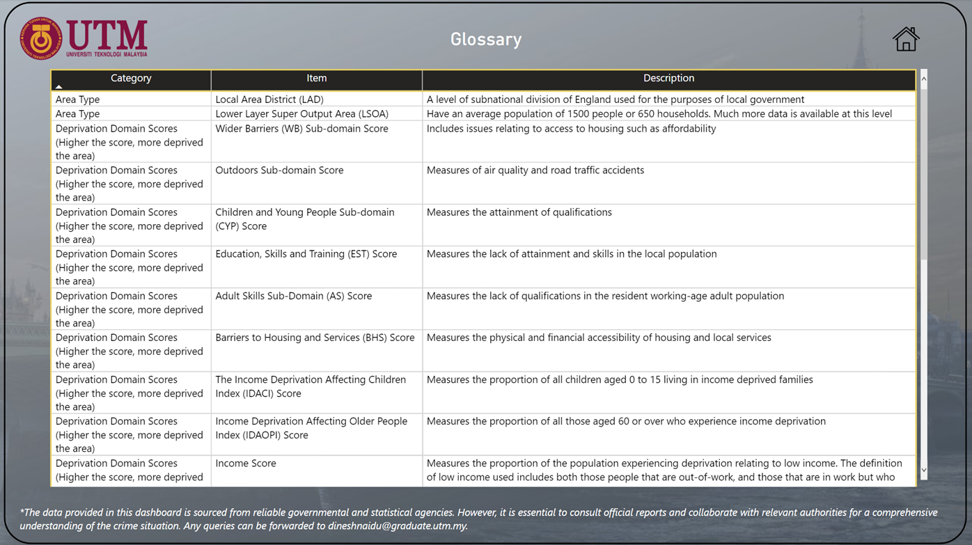 Figure 9: Glossary page of Dashboard
The Python scripts to perform the prediction on crime rates mentioned in this article are hosted in my Github Repo. Should anyone require the Power BI dashboard file of this project, you may do so by requesting it via LinkedIn.